My role: UX Design, UI Design, User interviews
Year: 2021
Project completed at Valsplat with my colleague Julian Neef
NLZIET is the Dutch leading streaming service offering live and on-demand TV of the Dutch premium broadcasters.
NLZIET started back in 2014 as a single access platform to all premium Dutch broadcasters’ streaming services and live television. That the service is powered by different broadcasters is directly reflected in the interface. Exploring new content means choosing a broadcaster to browse their content. This doesn’t really match how users consume television content as their content interests transcend broadcaster boundaries.
Problem statement
How might we transform the platform from a broadcaster centered platform to a content centered platform?
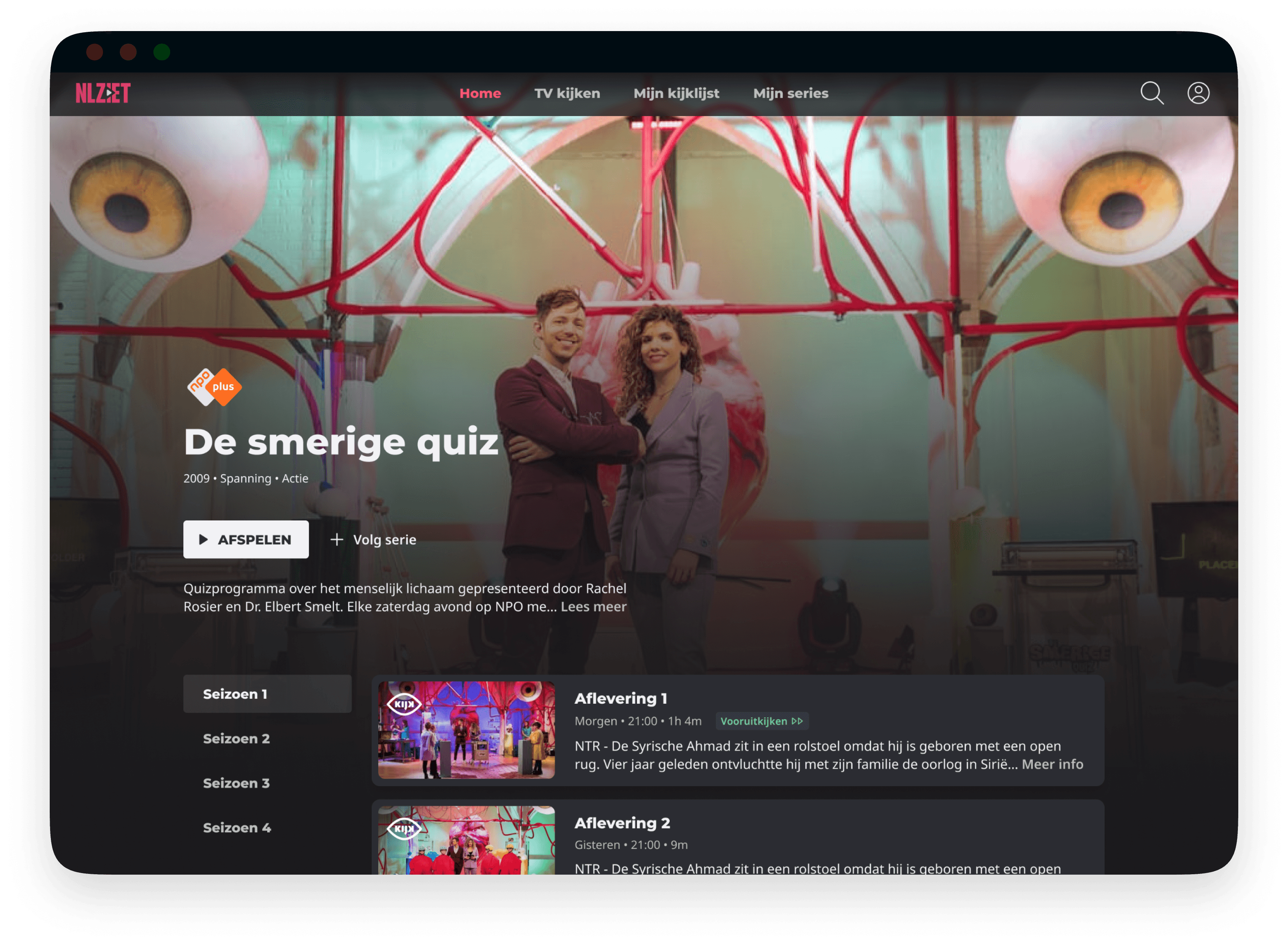
TV show detail page web.
A personalized landing
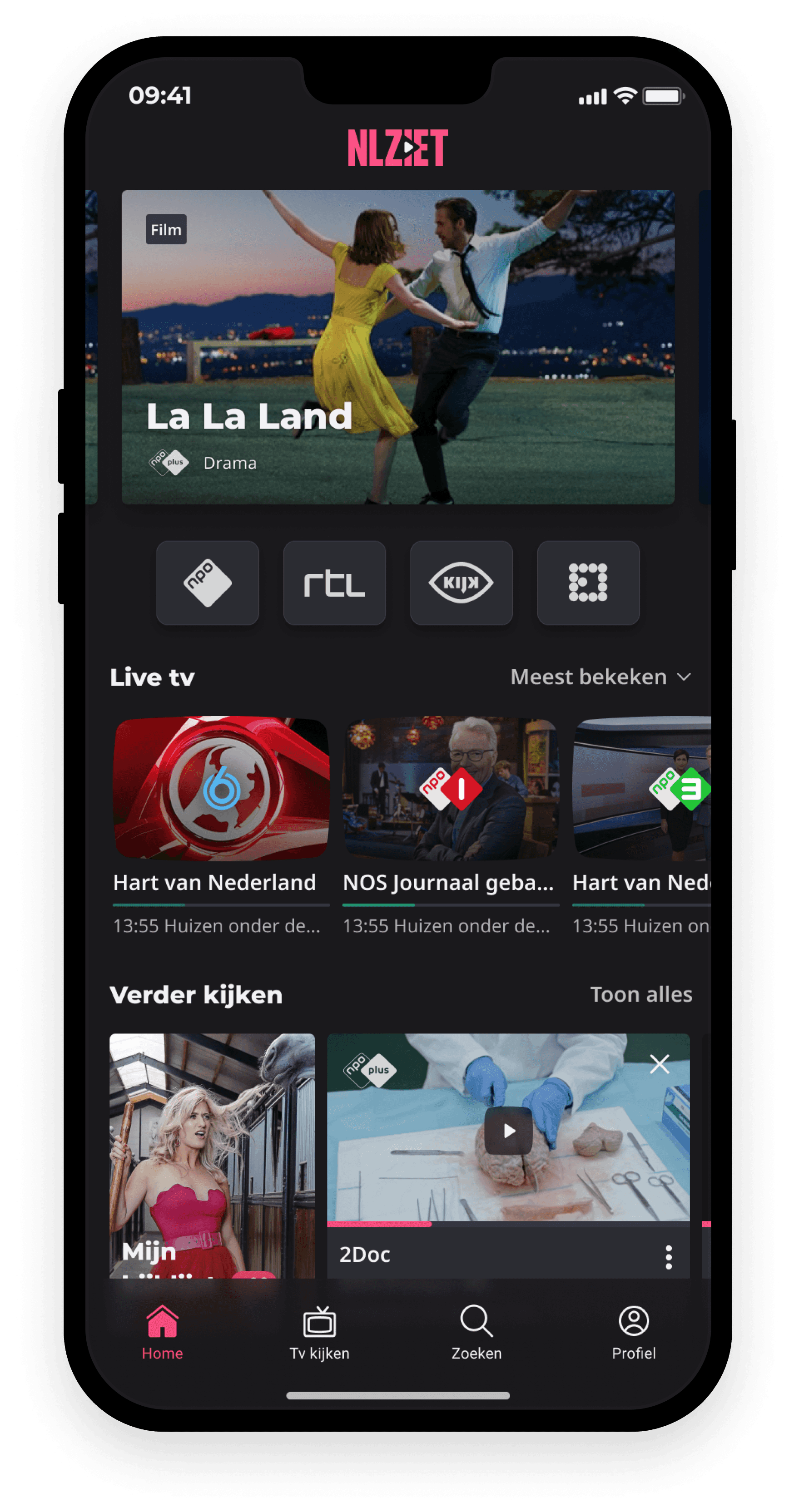
Users open NLZIET because they want to start watching something. To ensure that a user can start watching something as quickly as possible, the home screen is personalized. Only content that matches a user's watching behaviour is shown on the home screen.
Menu tab 'Home'
A guide for different use cases
User research showed that some people use a TV guide to see what is currently live. Others use a guide to see whether there is anything interesting to watch in the evening. Lastly, people mentioned that a guide offers an overview of all current programmes that are broadcasted on TV and therefore can have an inspiring effect.
In order to answer these three different needs we created different tabs within the tv guide; now and later, primetime, and everything. Each tab shows the programmes in a view designed for that specific timeframe.
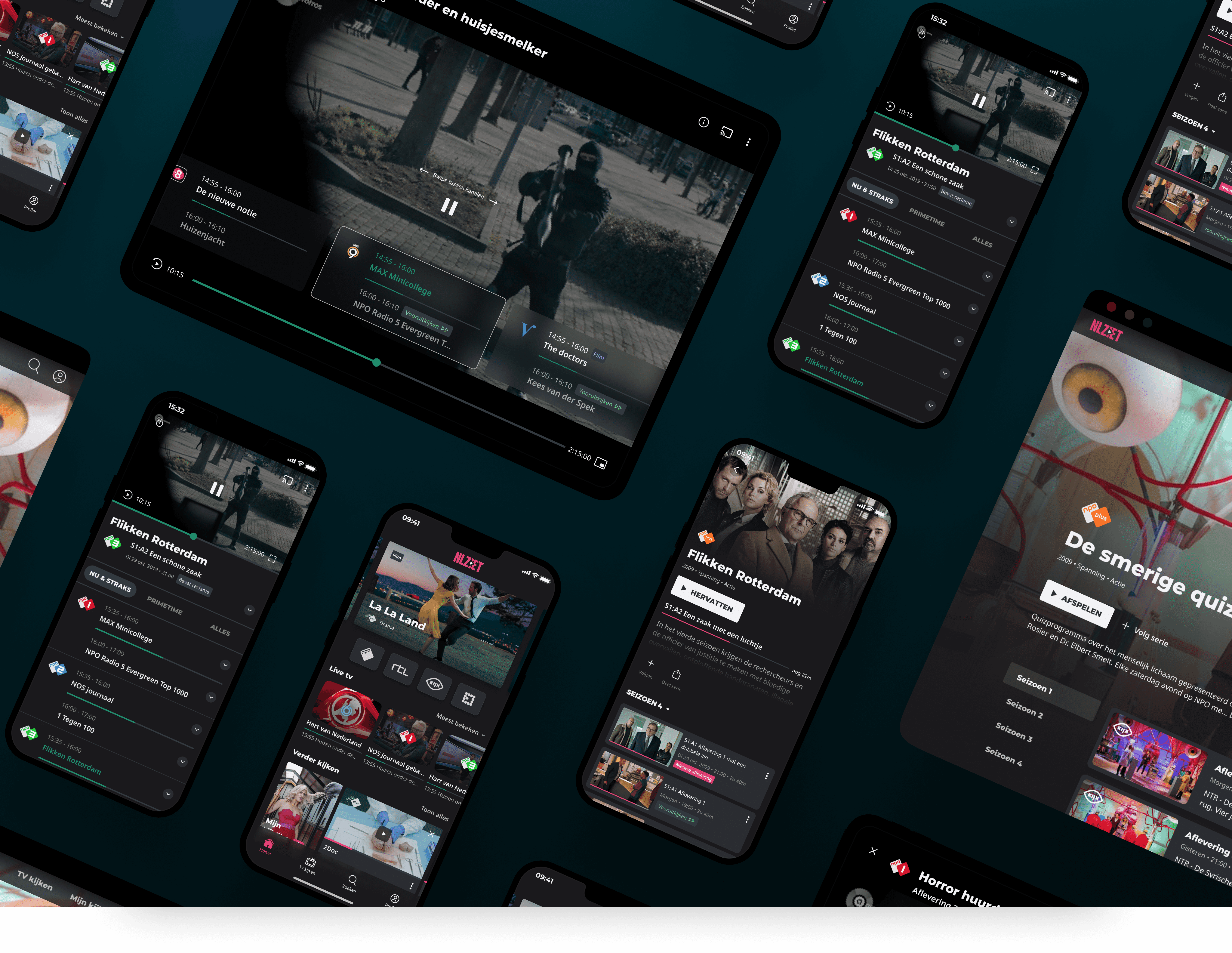
TV guide + player
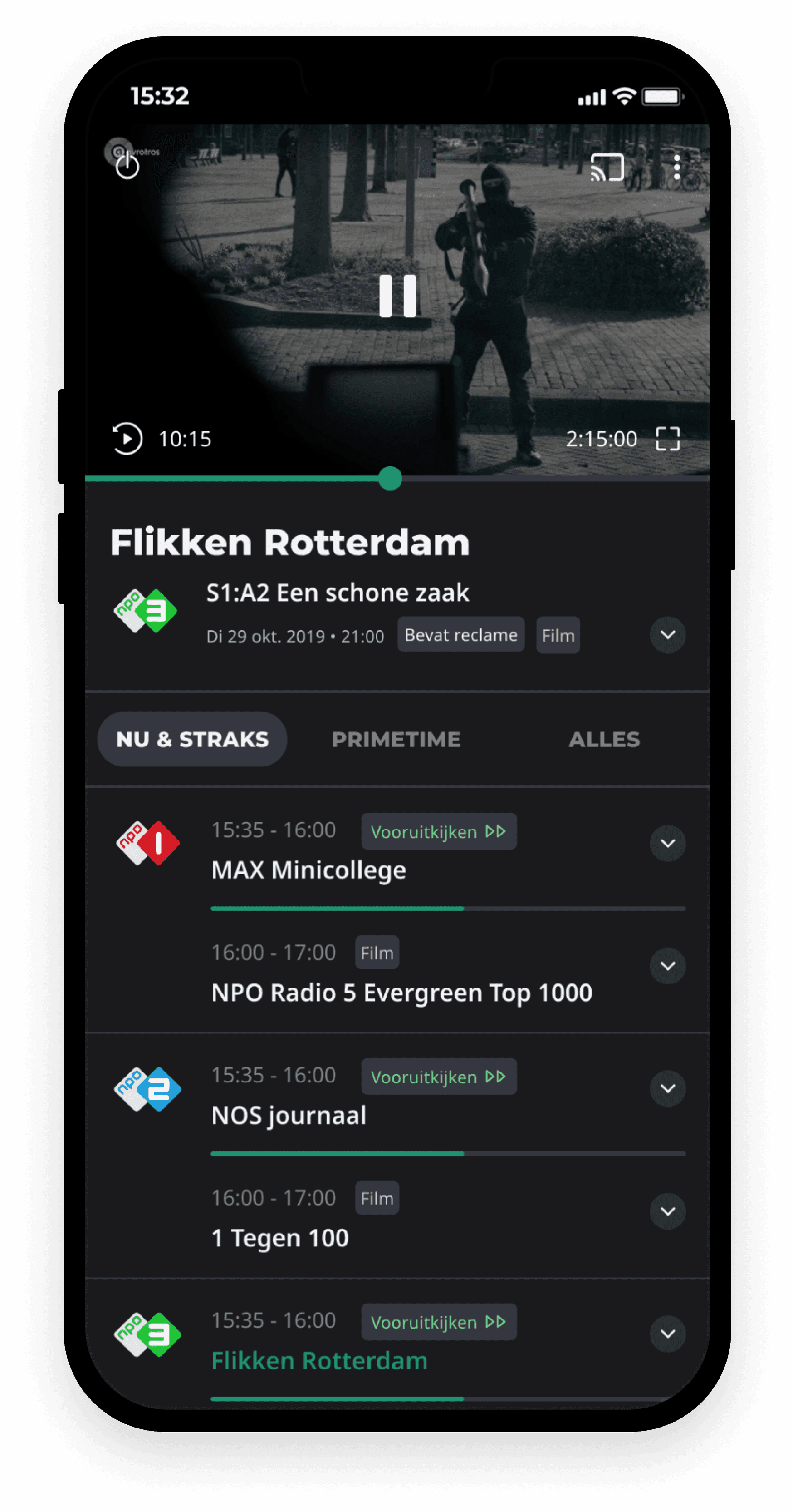
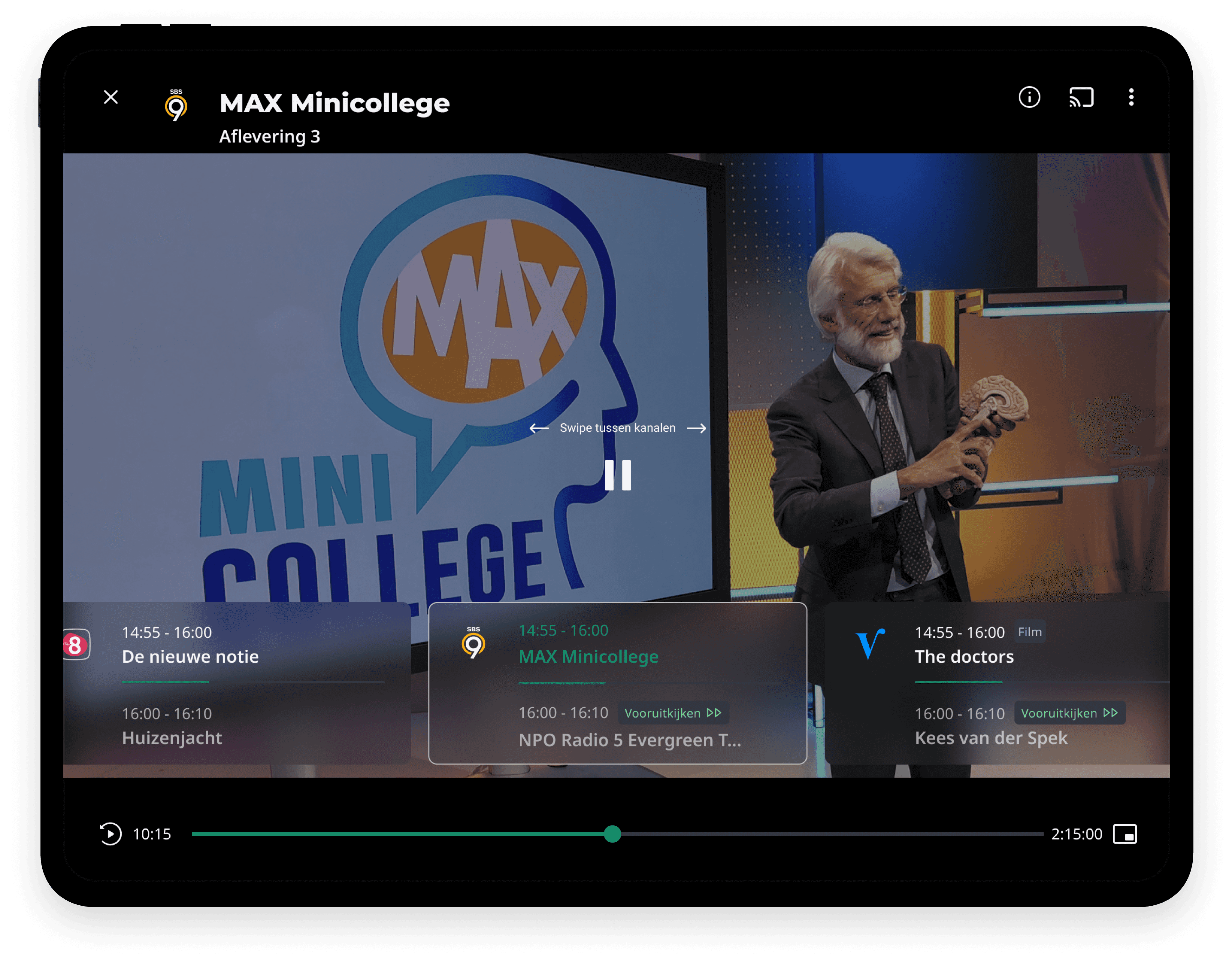
The possibility to check the tv guide while watching helps users to check if there's something more exciting to watch without interrupting their current watch flow.
TV guide + player
A different color for live and vod items
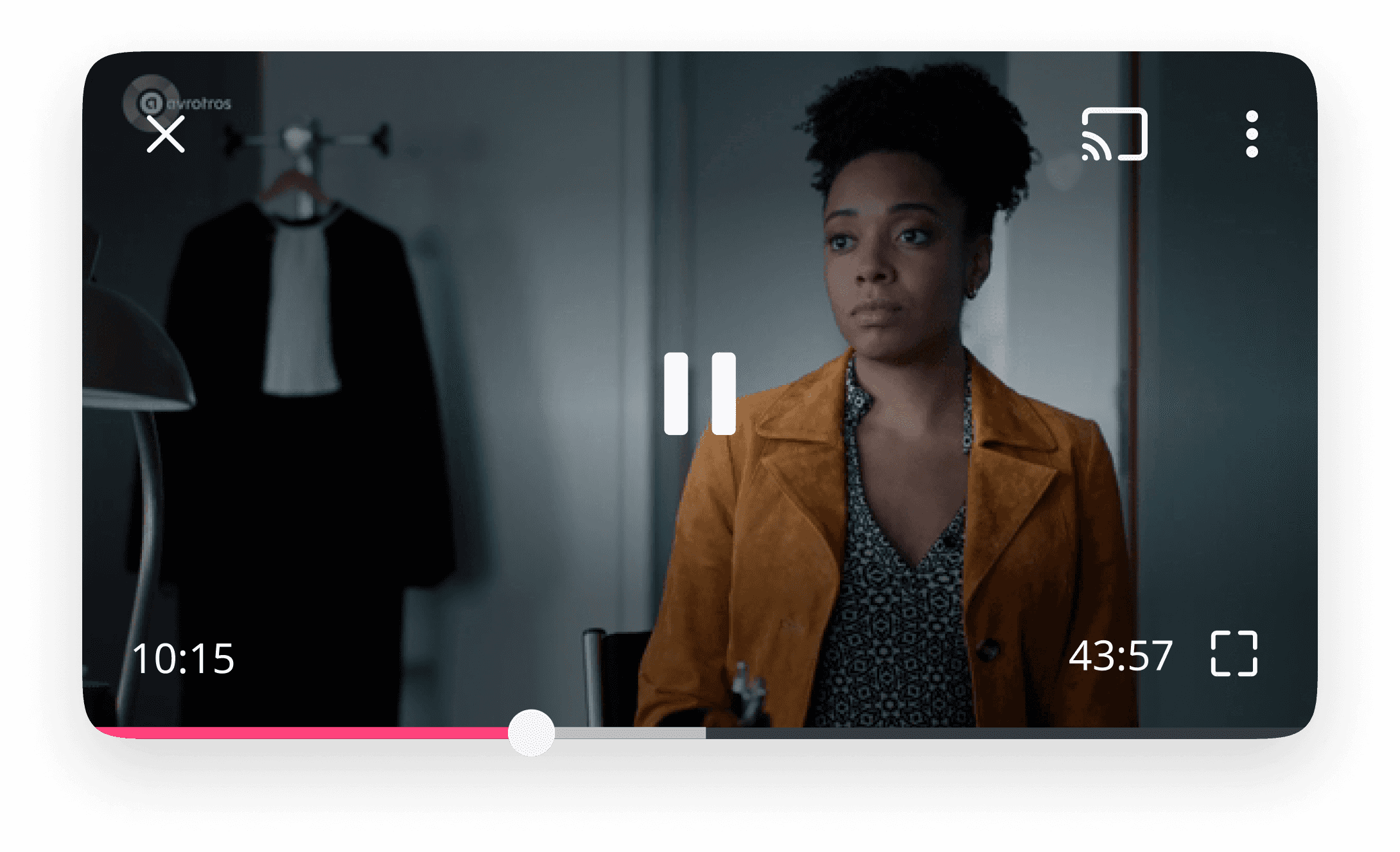
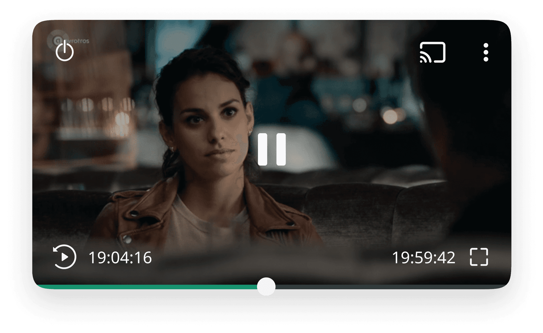
Live content has different properties compared to VOD content (e.g. ads, and fast forwarding). One of the things we did in order to prepare a user for upcoming ads in live content is assigning different colors to the progress bar. Live content has a green progress bar, while VOD content has a pink progress bar.
Live video item
Video on demand item
