My role: UX Design, UI Design, User interviews
Year: 2021
Project completed at Valsplat with my colleague Julian Neef
Roomplanner, part of Floorplanner
Roomplanner is an extension of Floorplanner. A platform, based around a floor plan editor that runs in every browser. The tool gives users the ability to make great looking architectural visualisations of their home and interior.
The Roomplanner extension is embedded within home and living webshops. Users use Roomplanner to view the webshops' products in a room they created themselves.
There are several challenges we solved during this project. First, Roomplanner is not very user-friendly, a lot of functionalities are spread over the tool without any hierarchy. Next to that, the visual style of Roomplanner doesn't fit the style of the webshops. Finally, the relevance for webshops to embed Roomplanner within their webshop is to generate leads. However, users don't see the point of leaving behind their email address.
In order to solve these challenges, we conducted 5 user interviews with the target audience of Roomplanner.
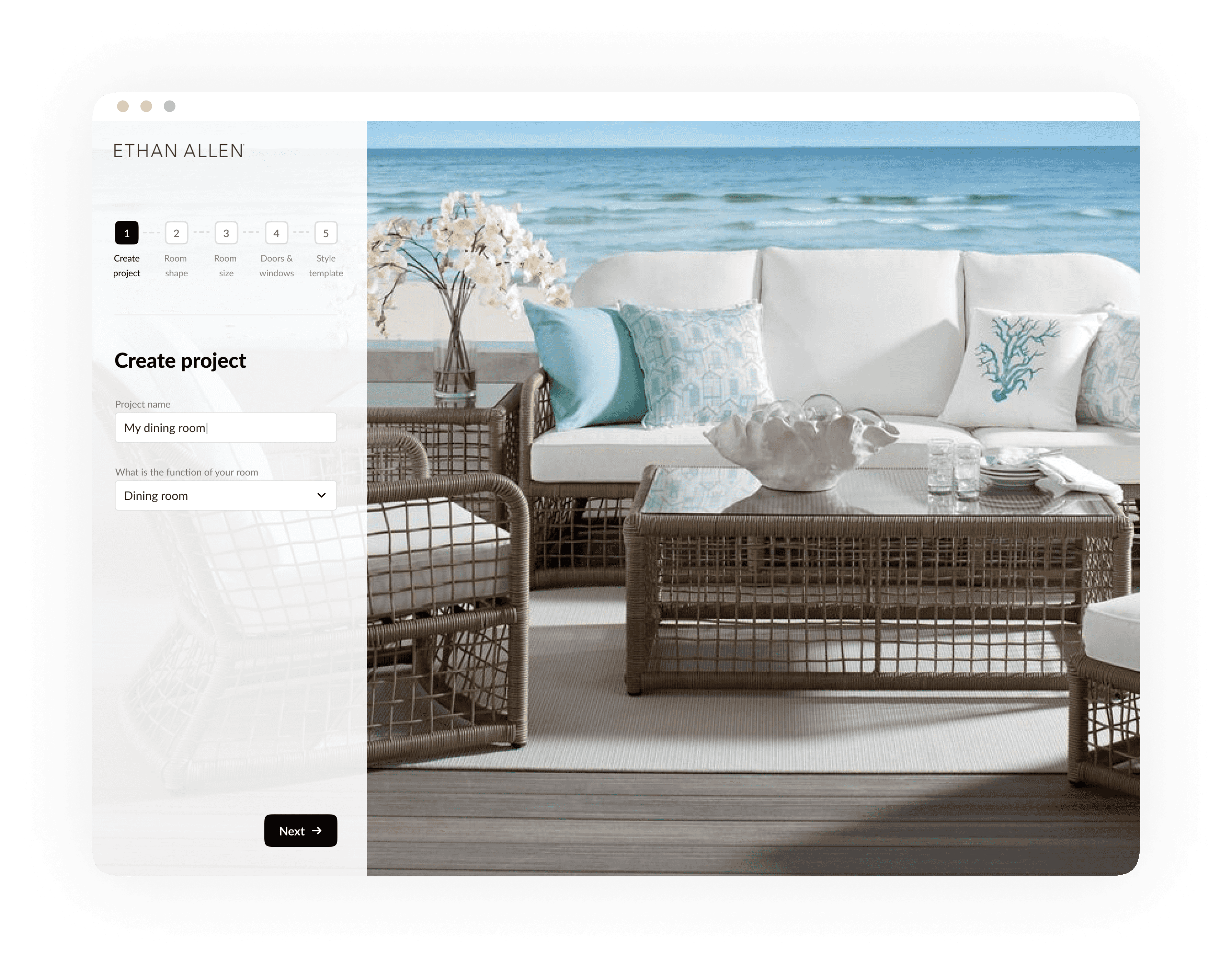
Adding step 1 to the step indicator
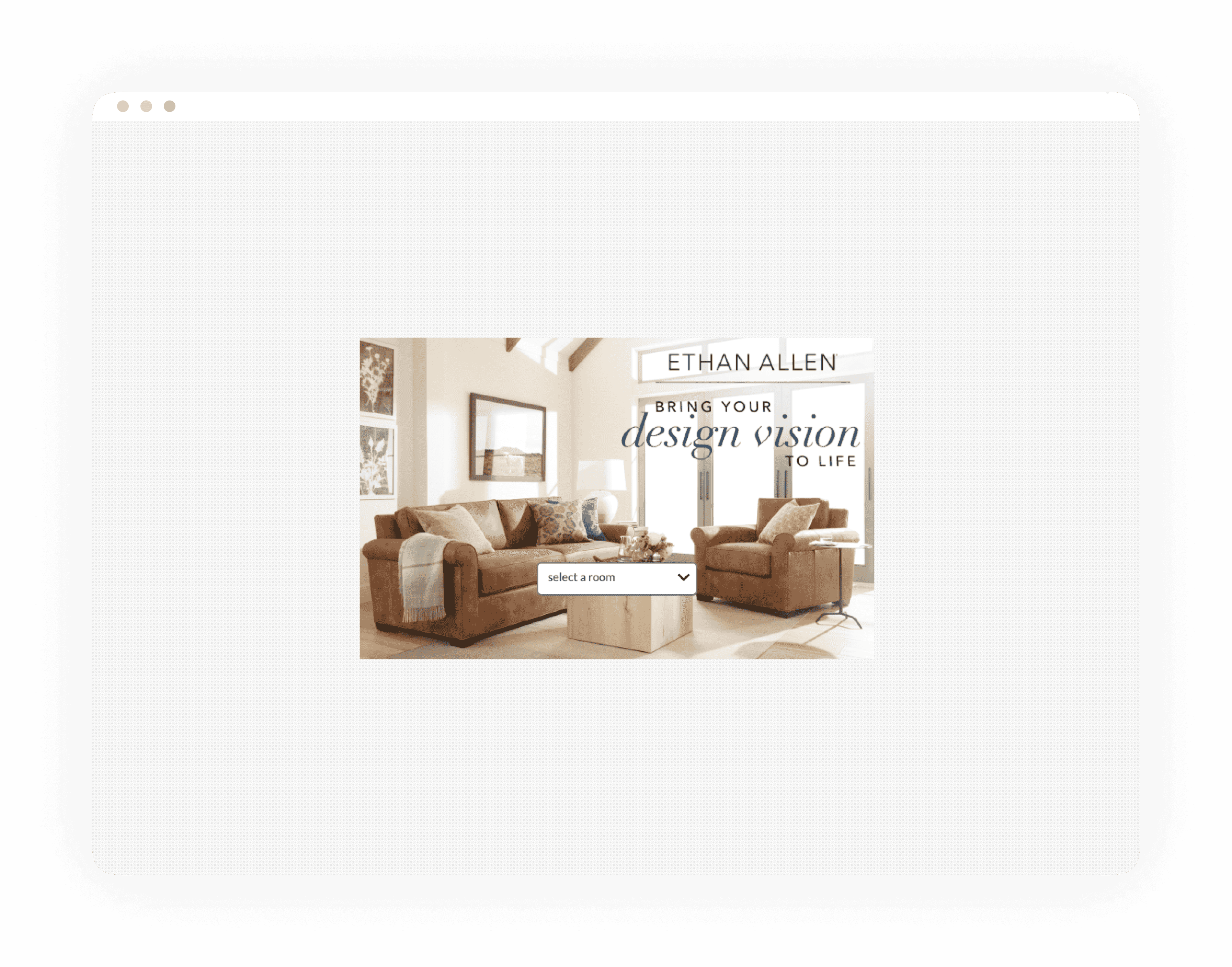
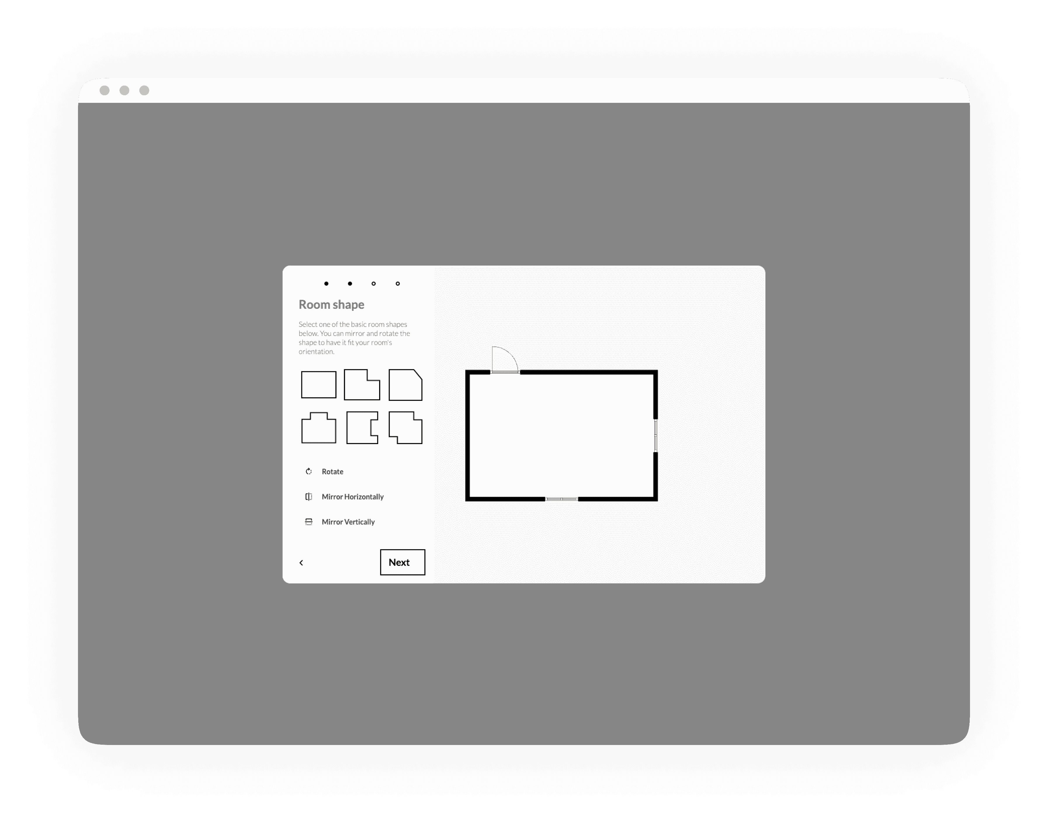
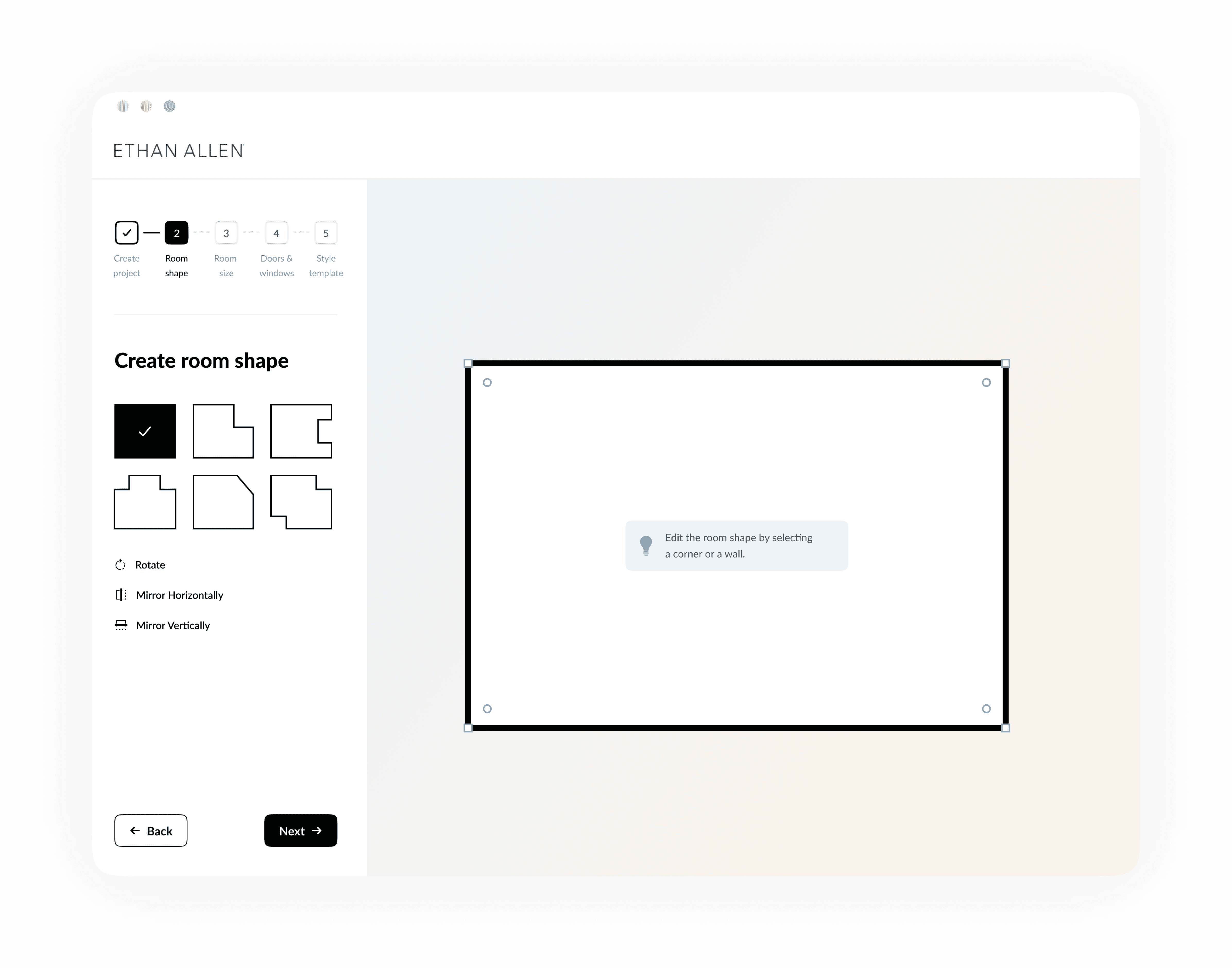
When opening Roomplanner, users pick a room type which is followed by step 2: selecting a room shape. A step indicator shows the current step to the user. However, this indicator is missing at step 1, which implies that users start the onboarding at step 2. That's why we added the step indicator to step 1 as well.
Old design of onboarding step 1.
Old design of onboarding step 2
New design of step 1 in the onboarding.
New design of step 2 on the onboarding.
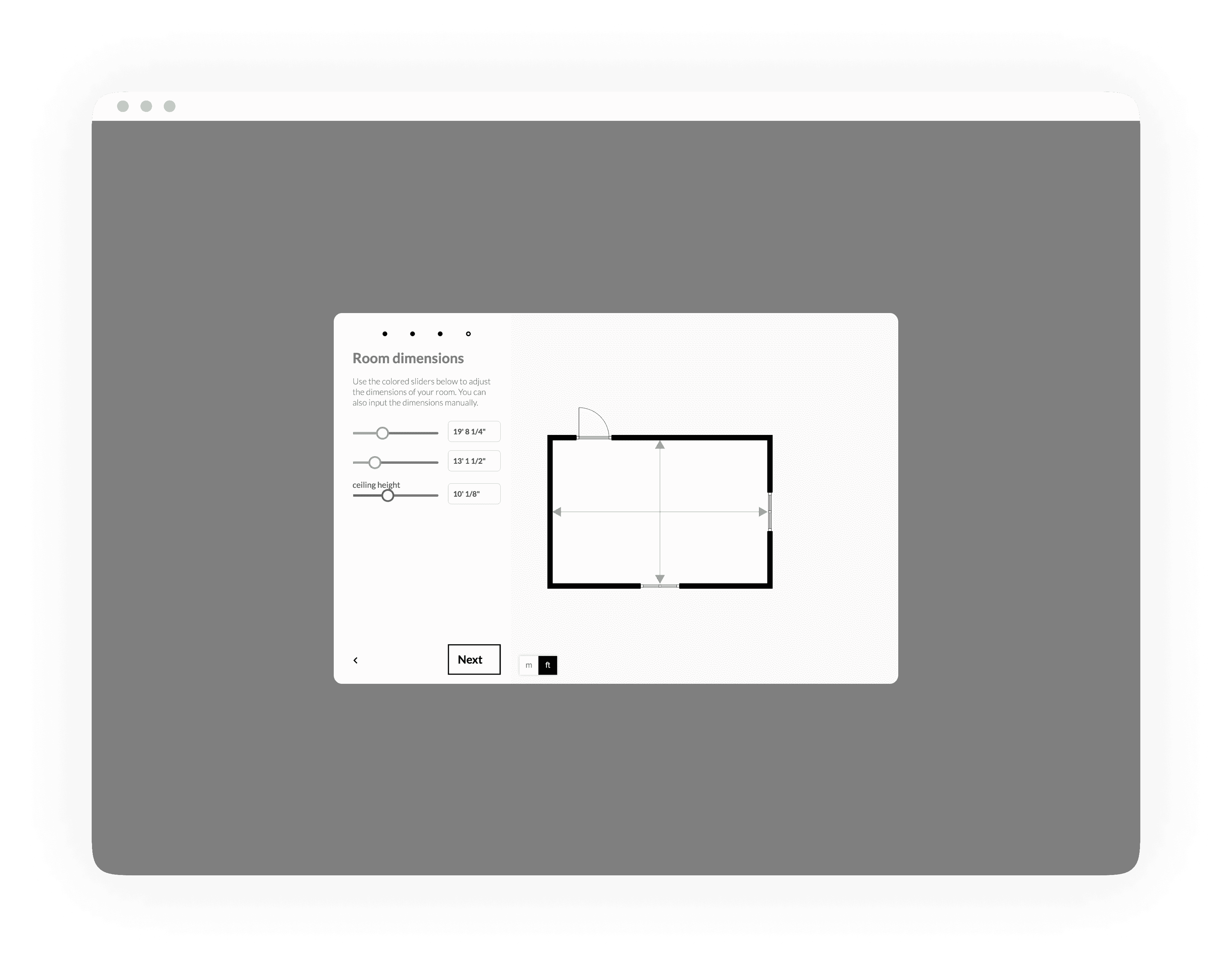
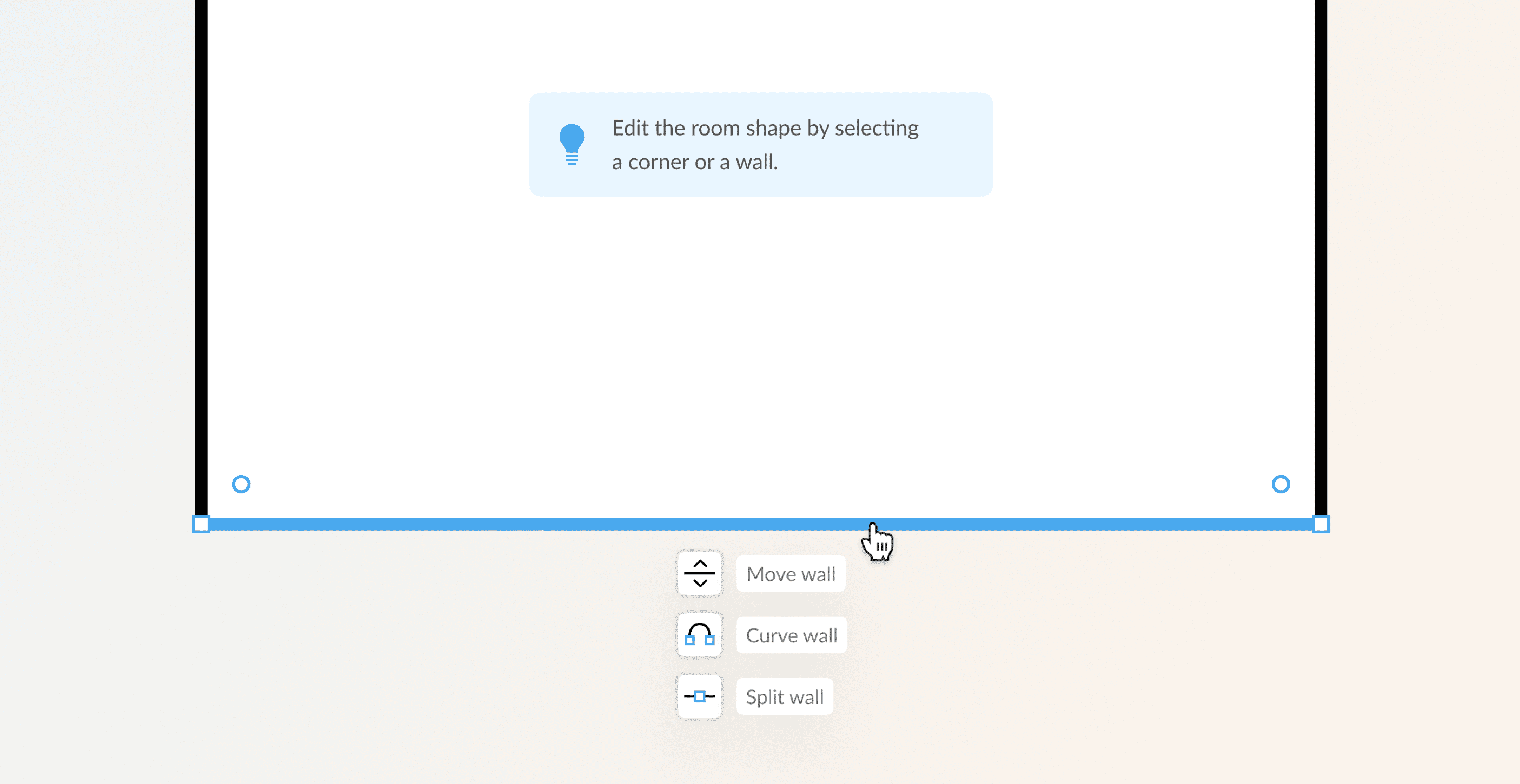
At step 2 users are asked to select a room shape, followed by step 3: the room configurator in which windows can be added and dimensions of the room can be set. Step 2 and 3 offer the possibility to add windows and doors to the room shape. However, test results showed that no participant made use of this functionality. That's why indicators were added to the interactive elements. These indicate the user that the shape and position of the elements can be manipulated.
Old design without indication that walls and doors can be moved.
New design shows move indicators and extra options when hovering a wall.
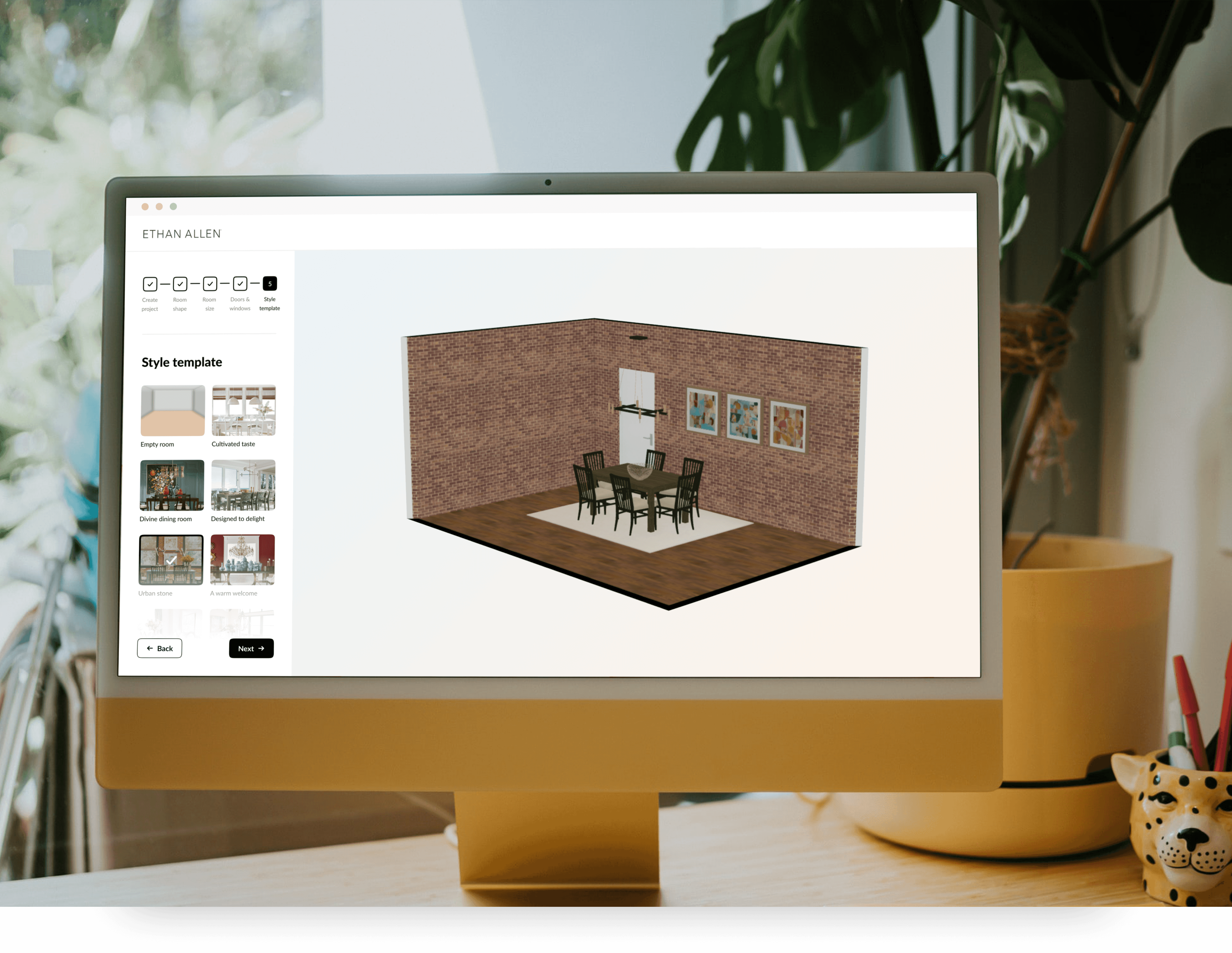
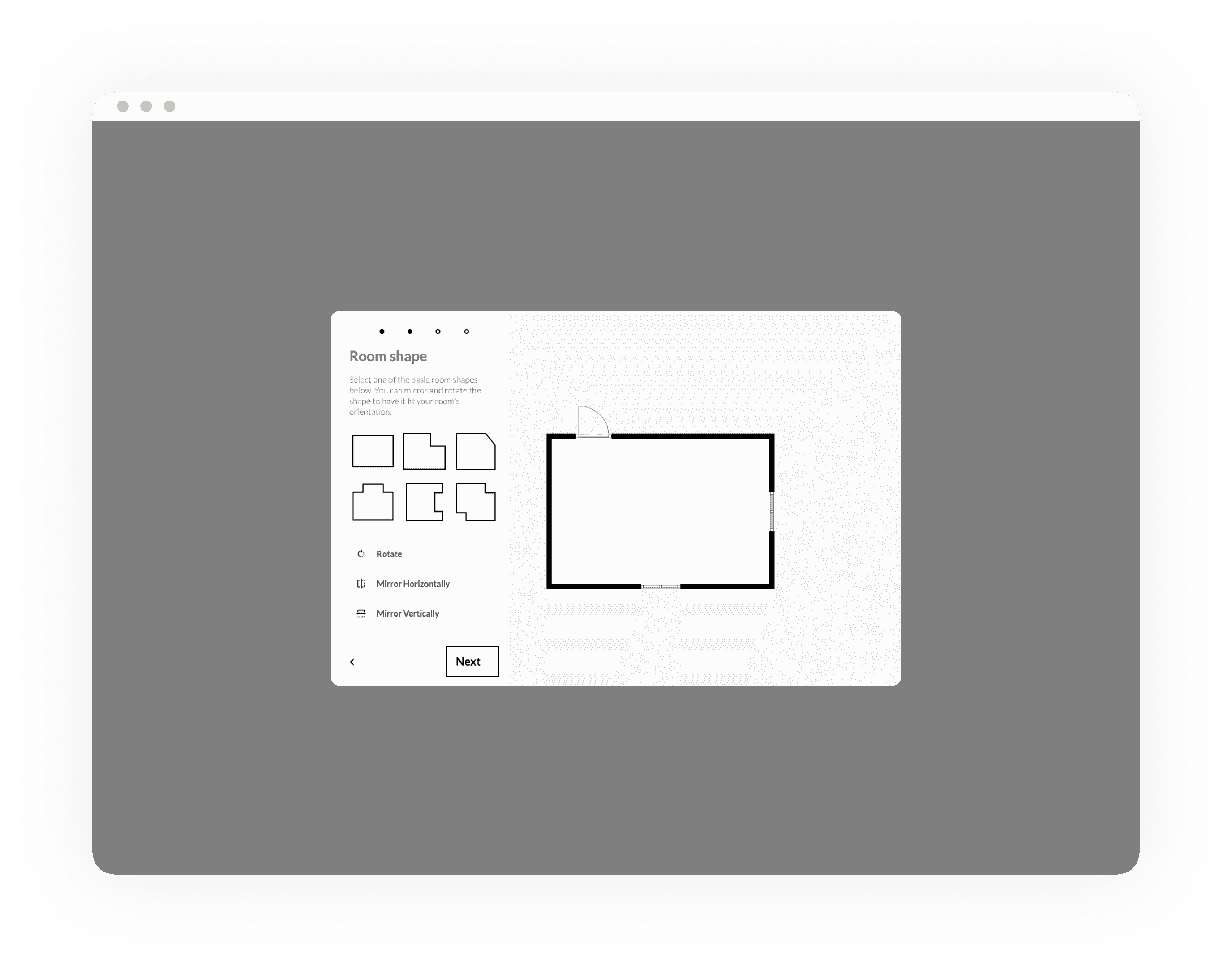
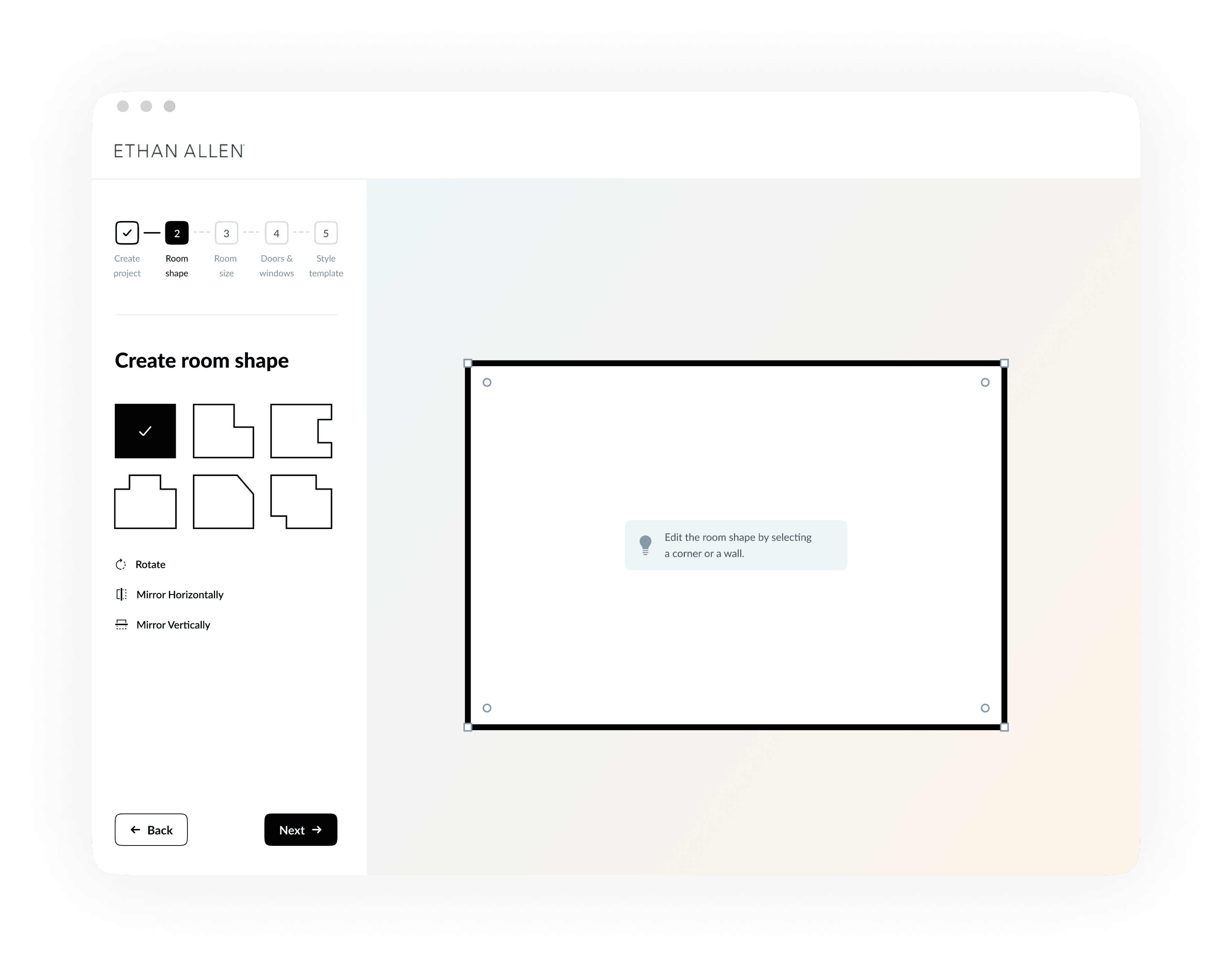
In general, the onboarding lacks of focus and some functionalities were not found by the participants. That's why we divided the onboarding in 5 steps. Each step focuses on one goal which increases a users' focus within a specific step.
Old onboarding
New onboarding
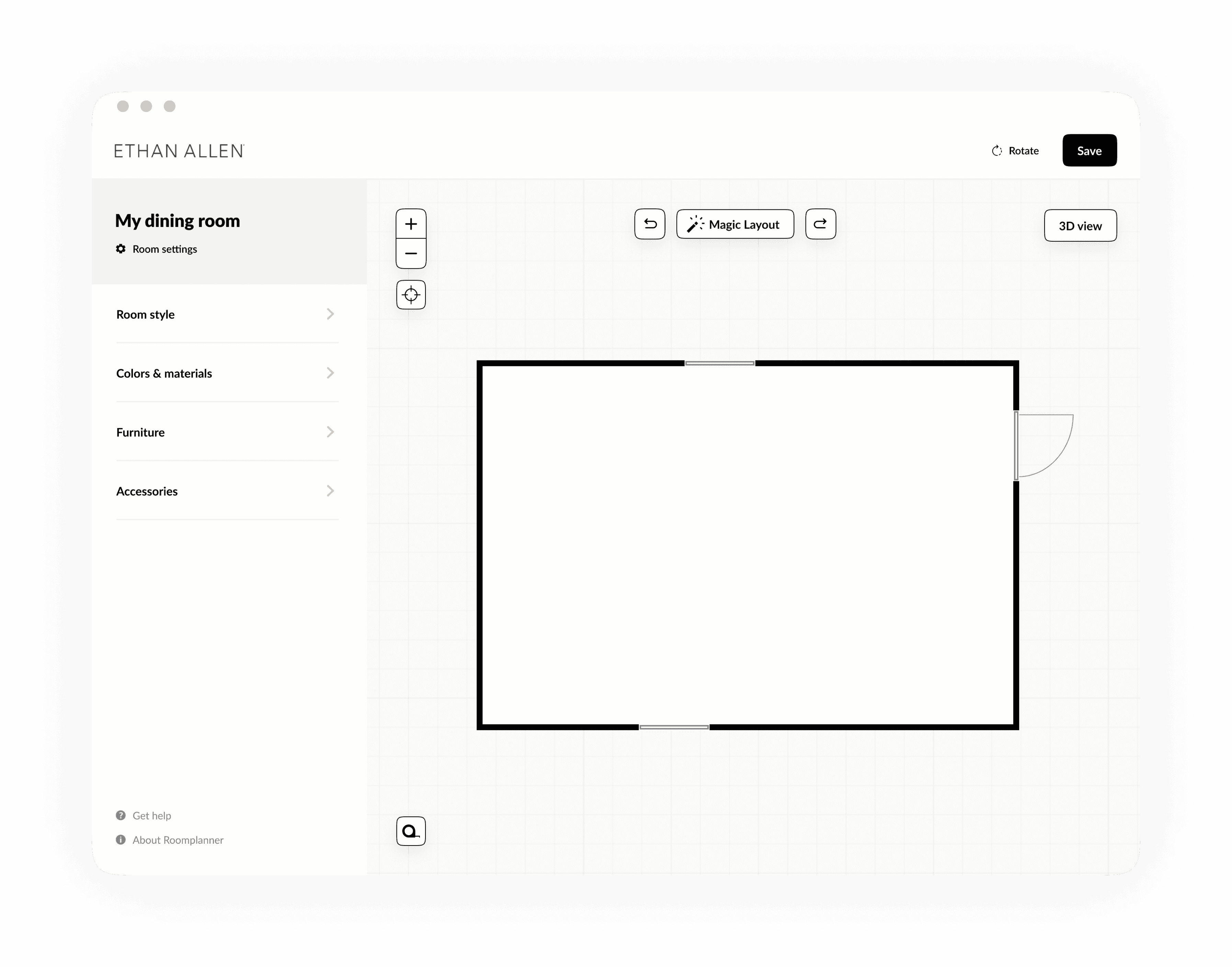
Adding focus to the homescreen
Test results showed that users don't expect to change the roomshape once they finished the onboarding. It’s a process they’ve completed, so why do it again?
That's why we moved this functionality from the home screen to 'room settings' in the menu. Moving this functionality also contributes to the goal of the homescreen; furnishing and styling the room.
New home screen in which the room shape can be edited behind the 'Room settings' option.
Replacing icons with labels
The interview results showed that participants were clicking back and forth between the menu items, because the icons didn't speak for themselves. That's why we replaced the icons with labels.
Old menu without labels.
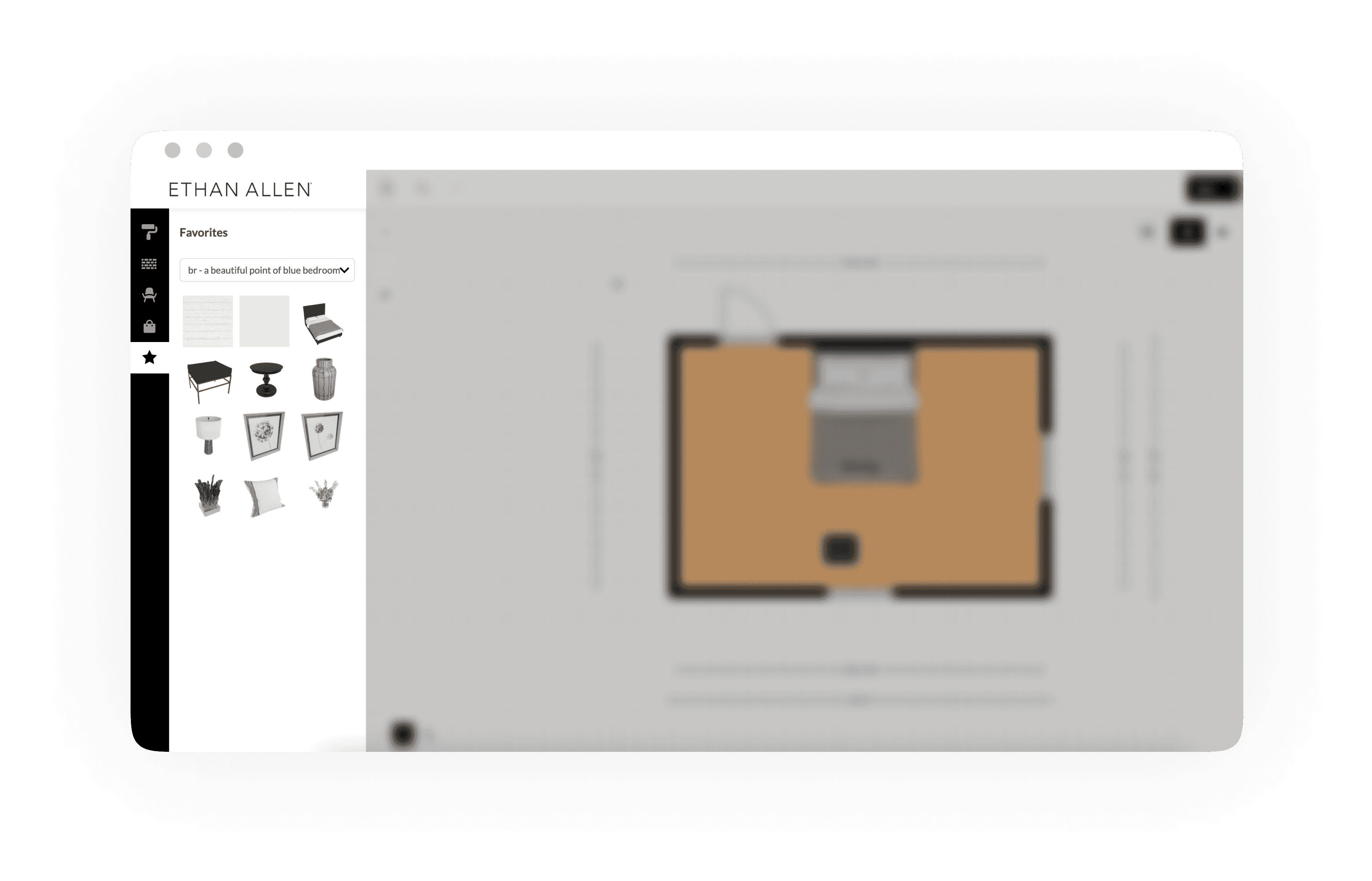
New menu with labels.
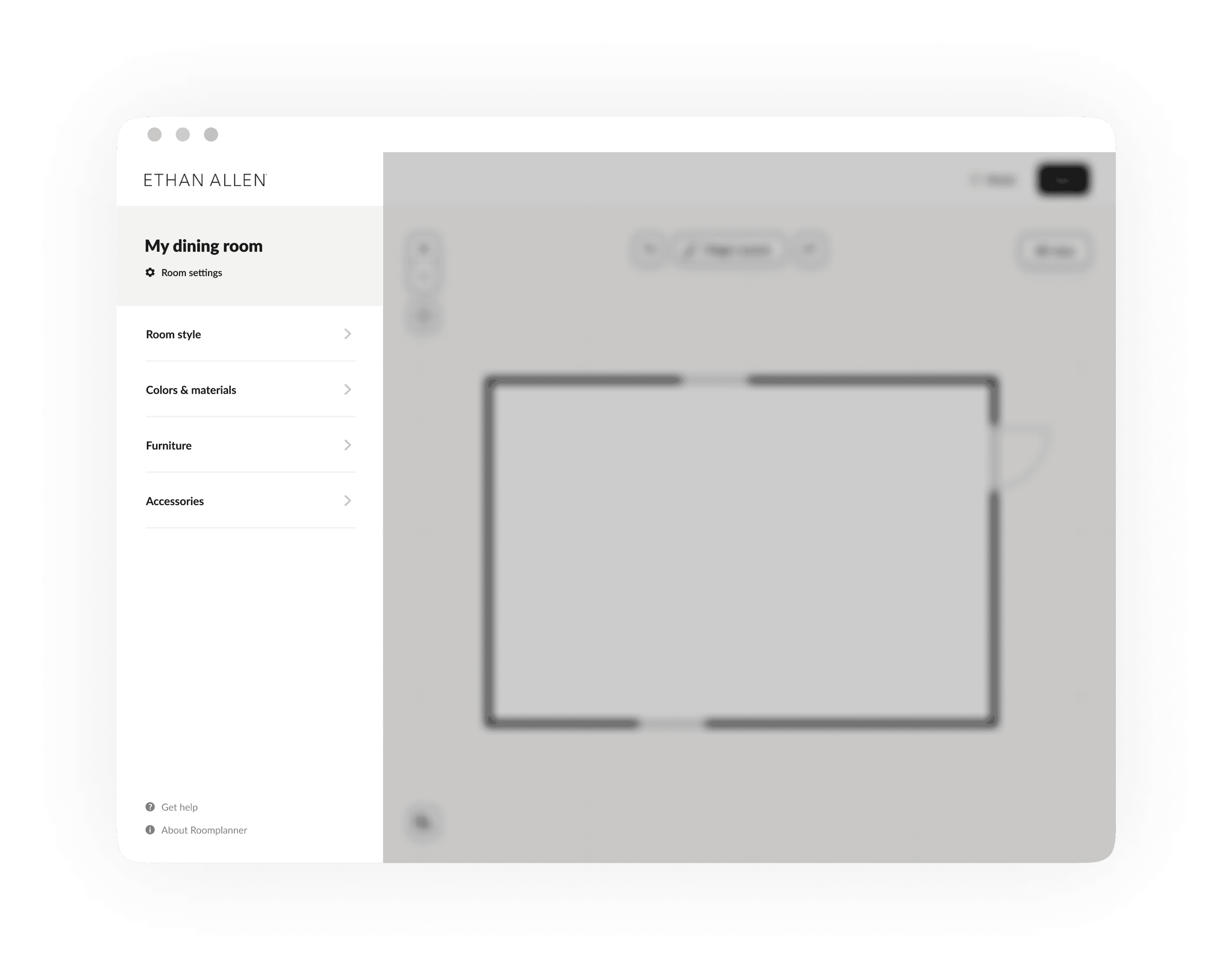
2D is edit mode, 3D is view mode
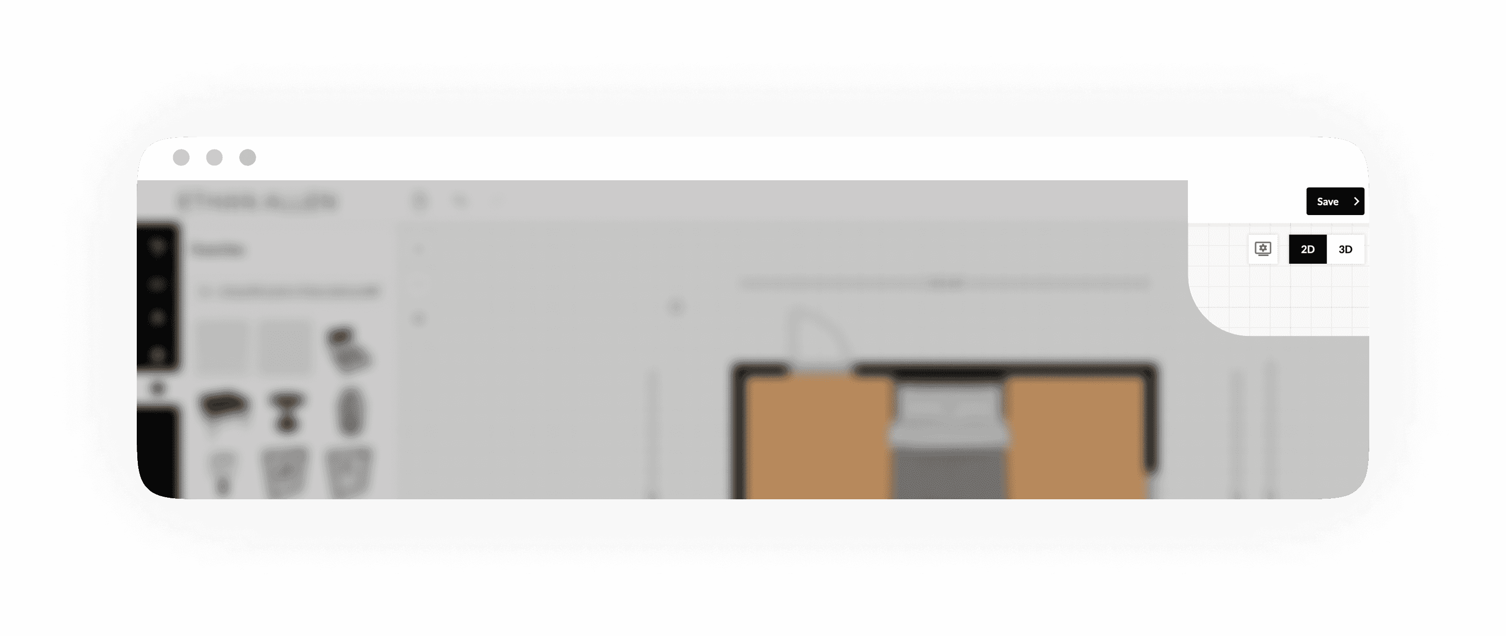
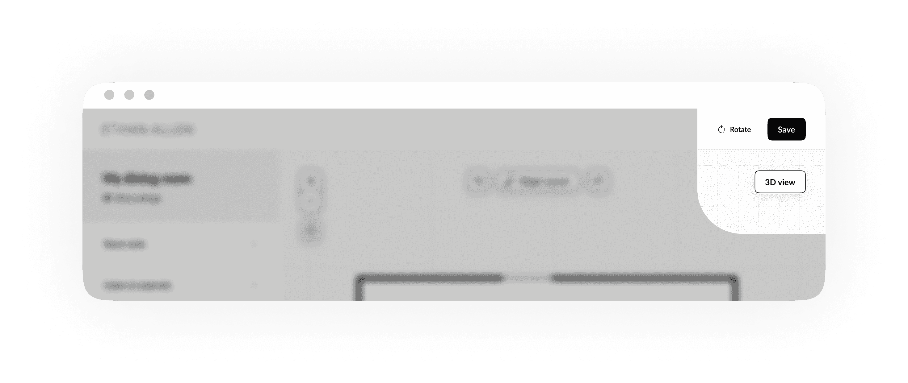
Another insight we gained was that users expect to move furniture in 2D and 3D mode. The difference between the two is that the 3D mode is a view only, and doesn't offer the possibility to move furniture. The switch component implies that 2D and 3D offer the same functionalities because they're presented next to each other. That's why we removed the '2D' label, because this is the default mode in which users are already editing. Next to that, we renamed the label from '3D' to '3D view' which makes the functionality more clear.
Old design in which '2D' and '3D' are presented next to each other.
New design of the '3D' view functionality.
An easier way of painting surfaces
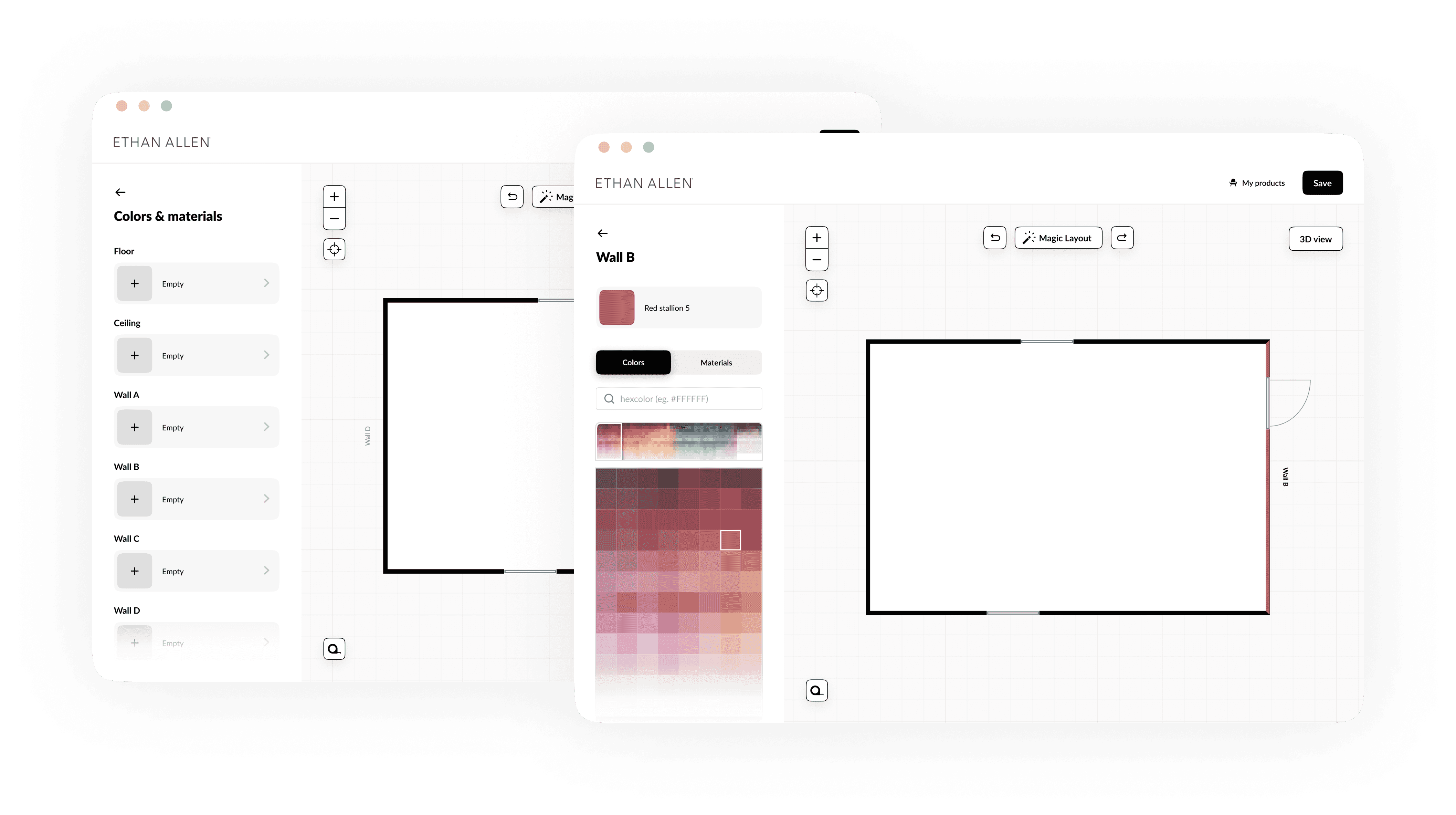
Another adjustment we made was the way walls and floors could be painted. Participants were confused by the fact that a wall could be painted from both sides, which doesn't make any sense since they are furnishing just one room. We removed the functionality to paint the outside of a wall. Next to that, we added the different surfaces that could be painted to the menu.
Old way of painting the room.
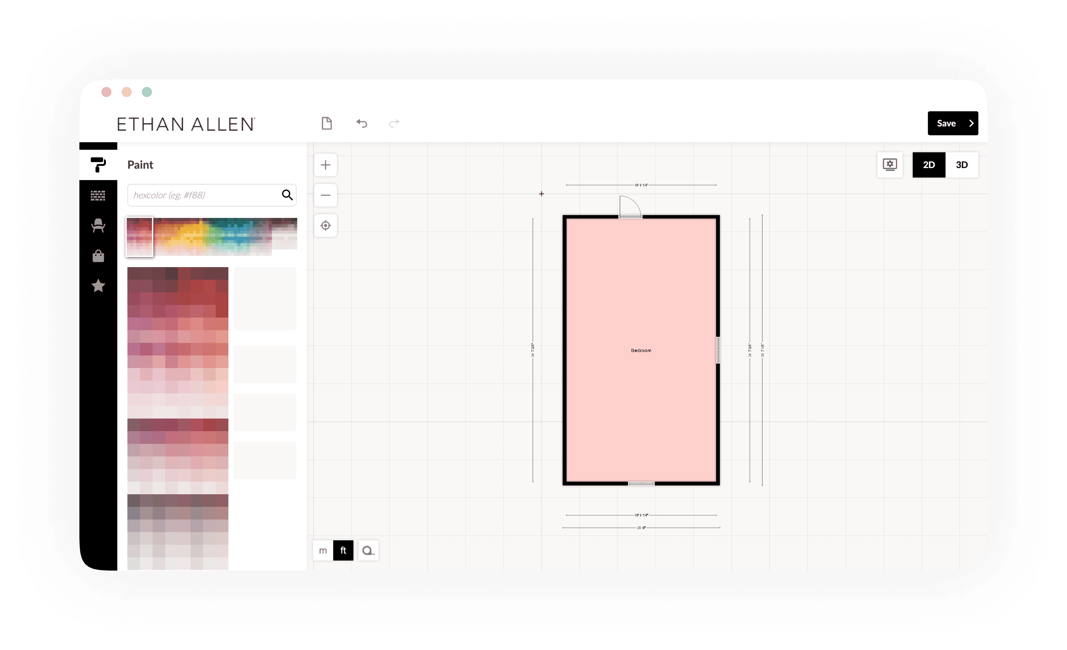
New way of painting the room.
An easier way of exploring furniture
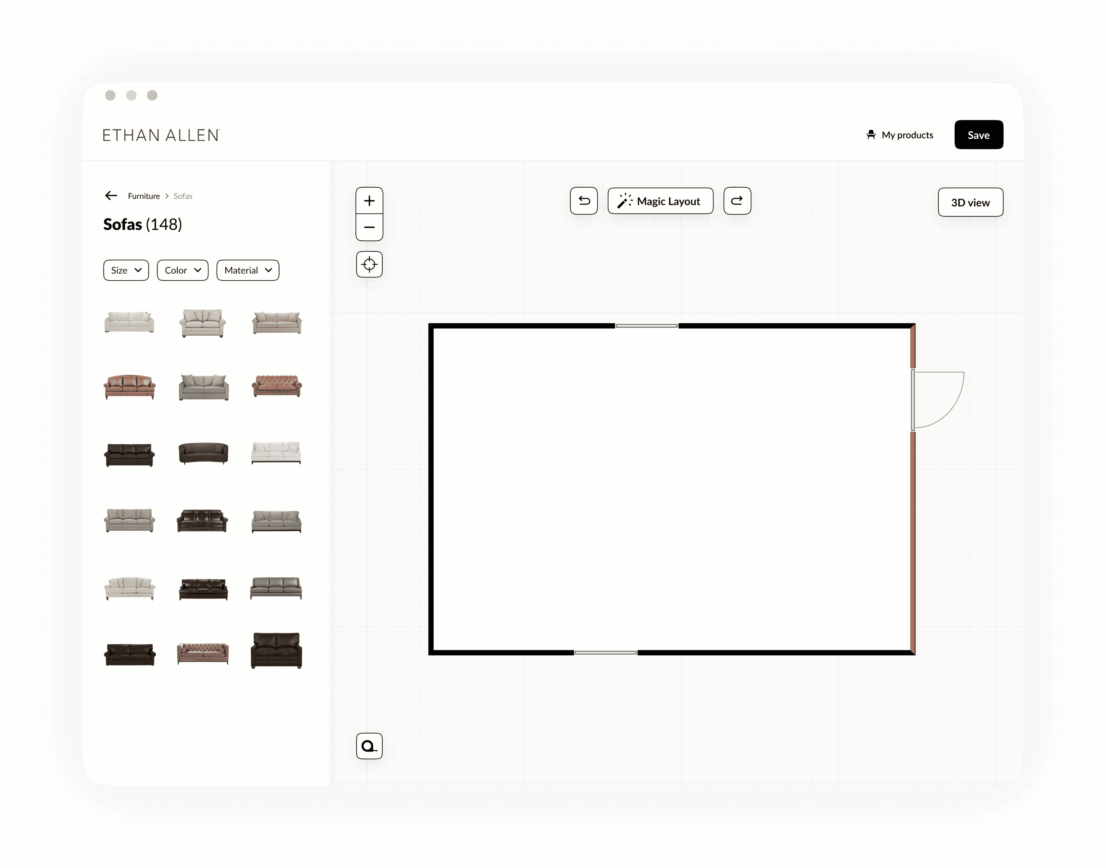
Participants experienced difficulties with finding furniture in the menu. Users start within their 'favorites' tab. Even when they didn't add any favorites yet. Next to that, the way furniture could be explored differs a lot from patterns users are familiar with in other webshops. That's why we added patterns of webshops to the way furniture could be explored.
New way of exploring furniture.
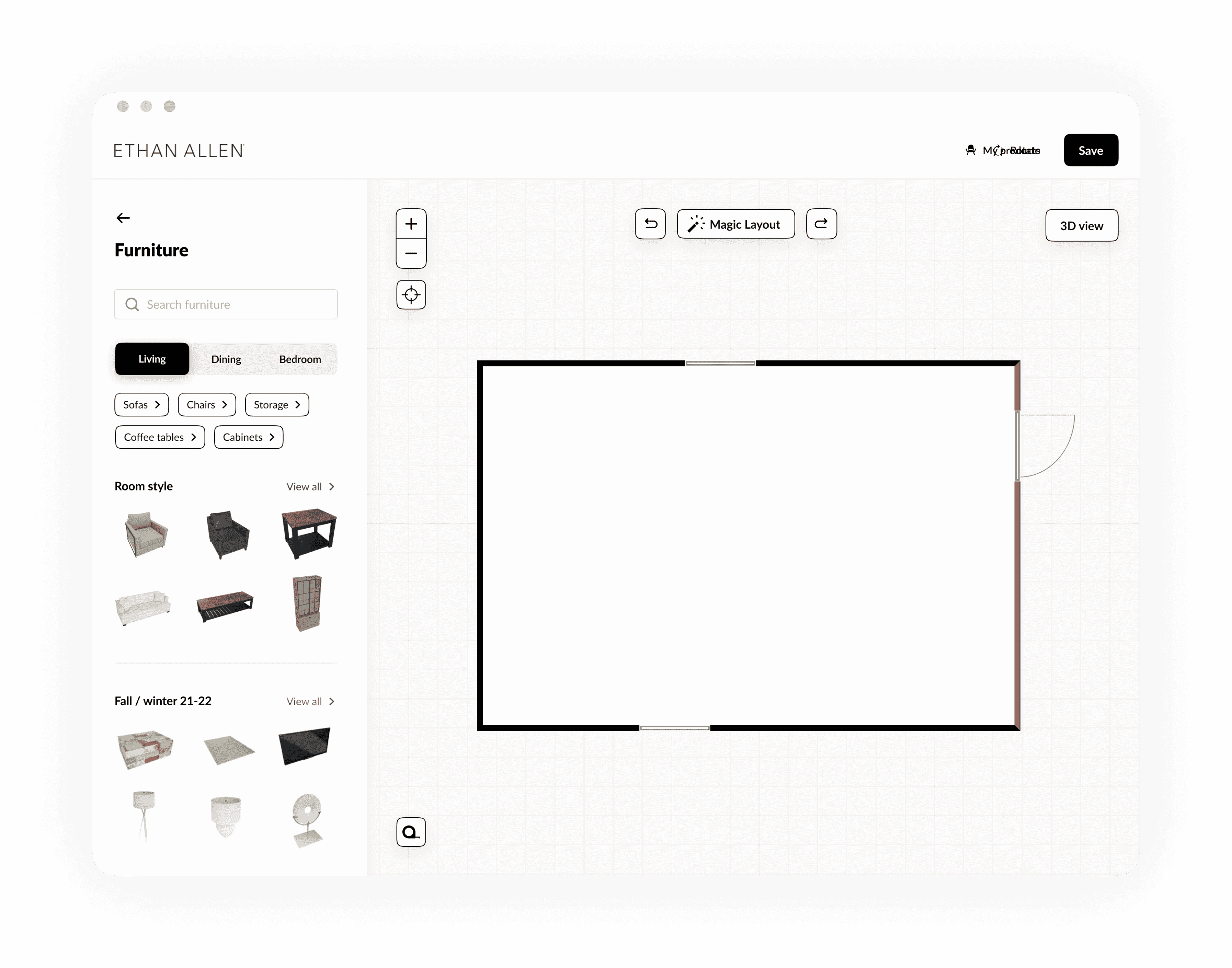
New way of exploring furniture.
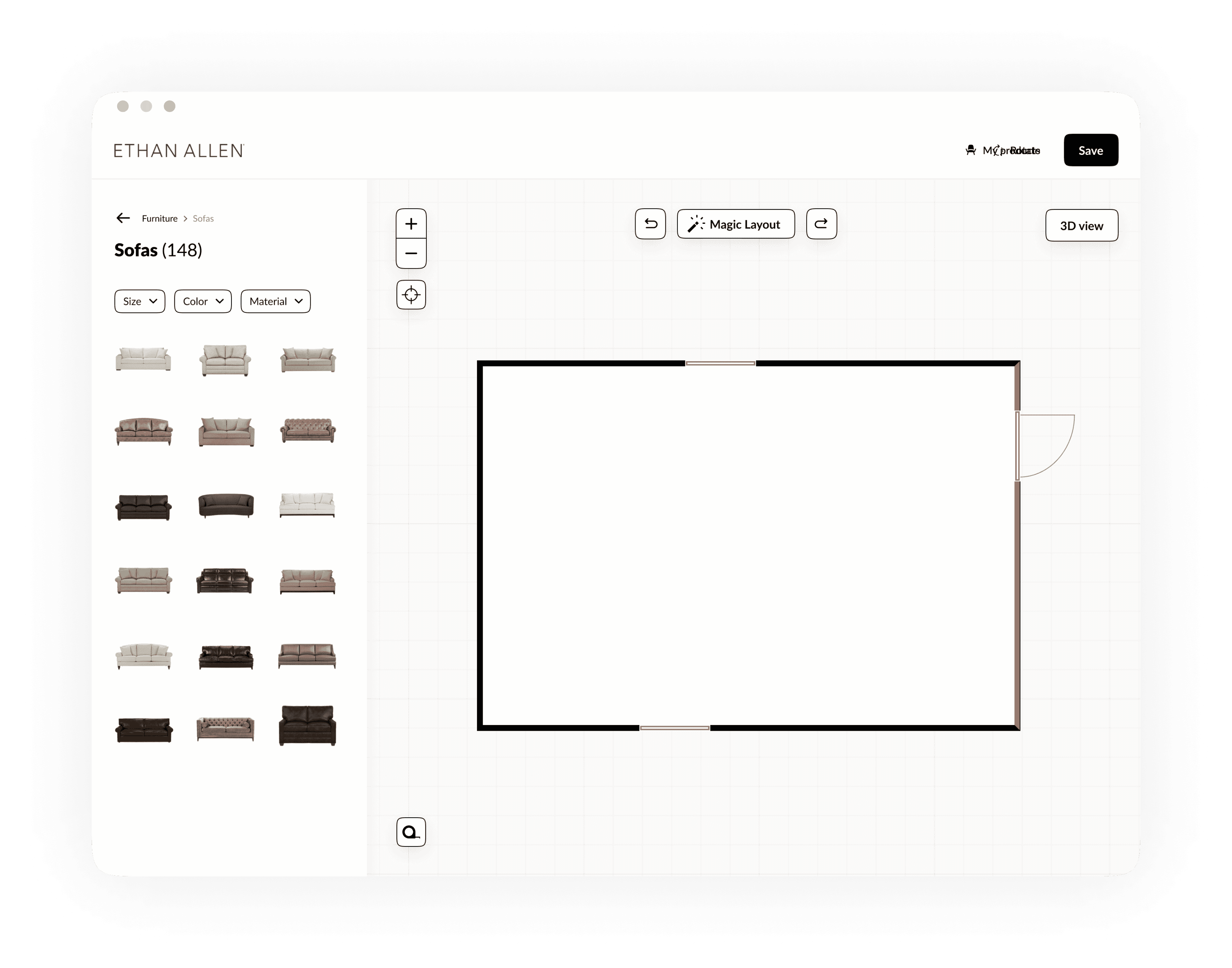
Adding hierarchy to the checkout flow
The final modal which asks to leave behind the users’ email address in order to save the design, lacks hierarchy. Too much irrelevant information is presented at the same time, which results in confusion.
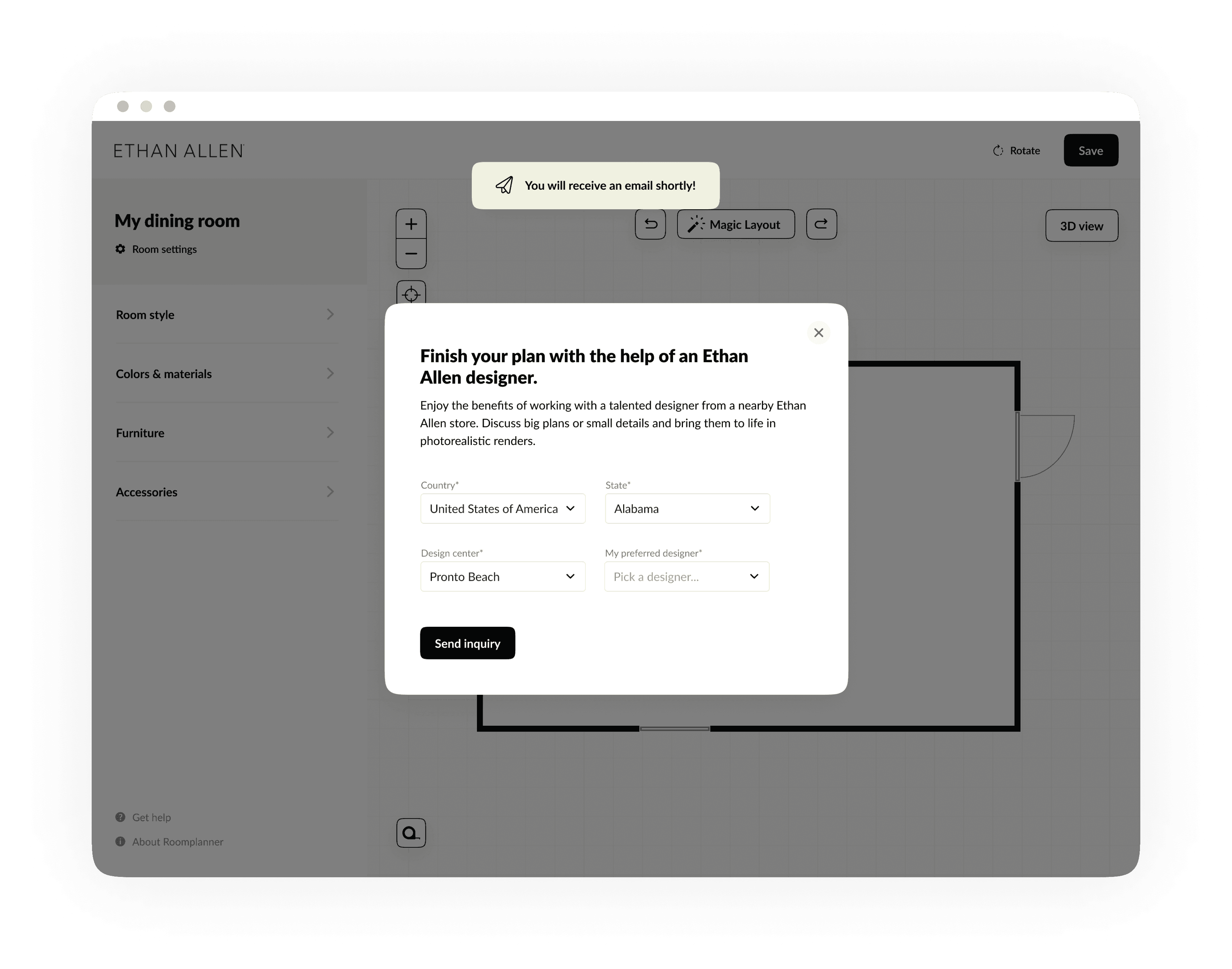
That's why we split up the modal over 2 modals; the first one, which asks to leave behind an email address in order to save the design. The second one (less relevant) asks if the user wants some help with the design from an Ethan Ellan designer.
Old modal in which design can be saved.
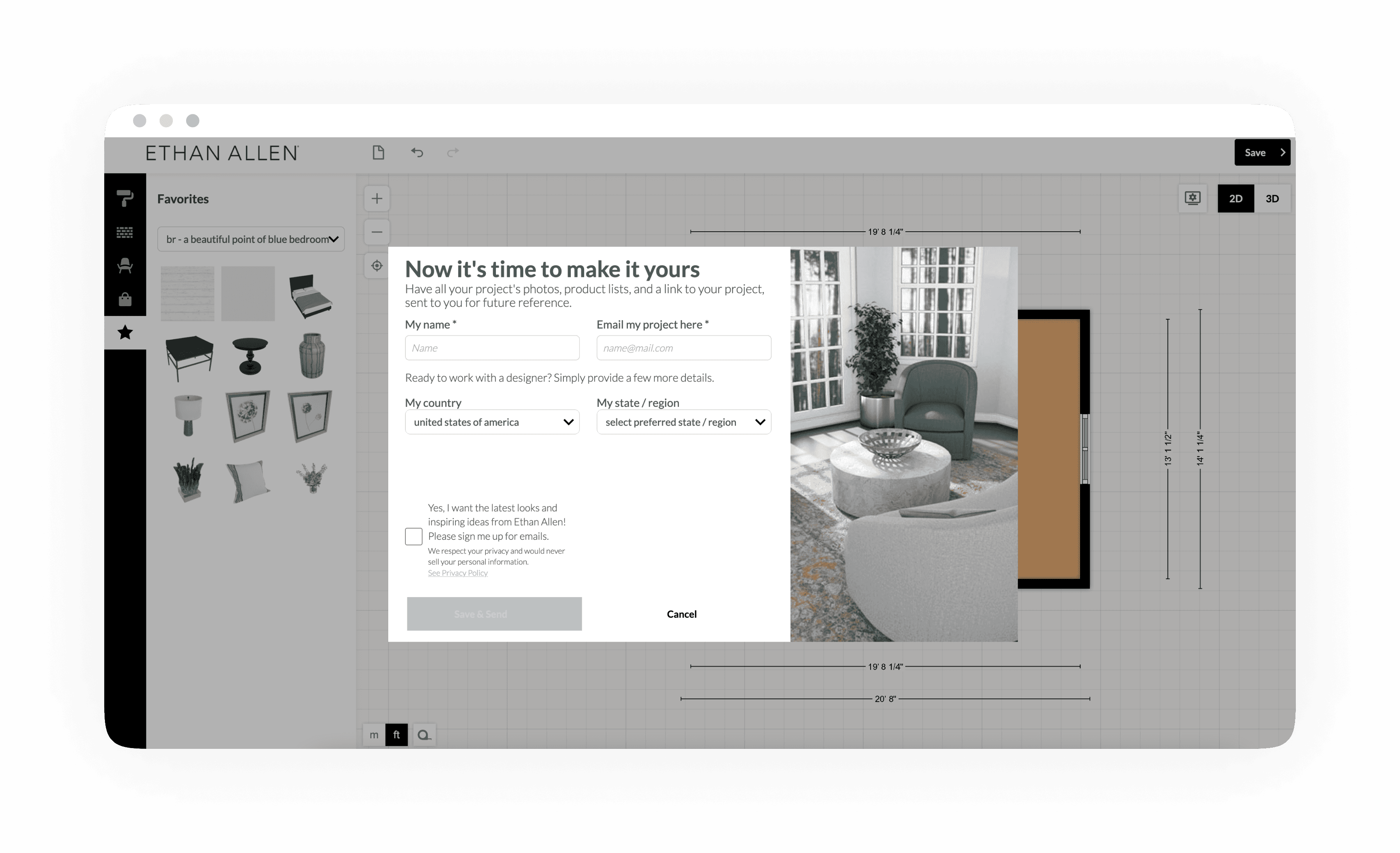
New modal in which design can be saved.
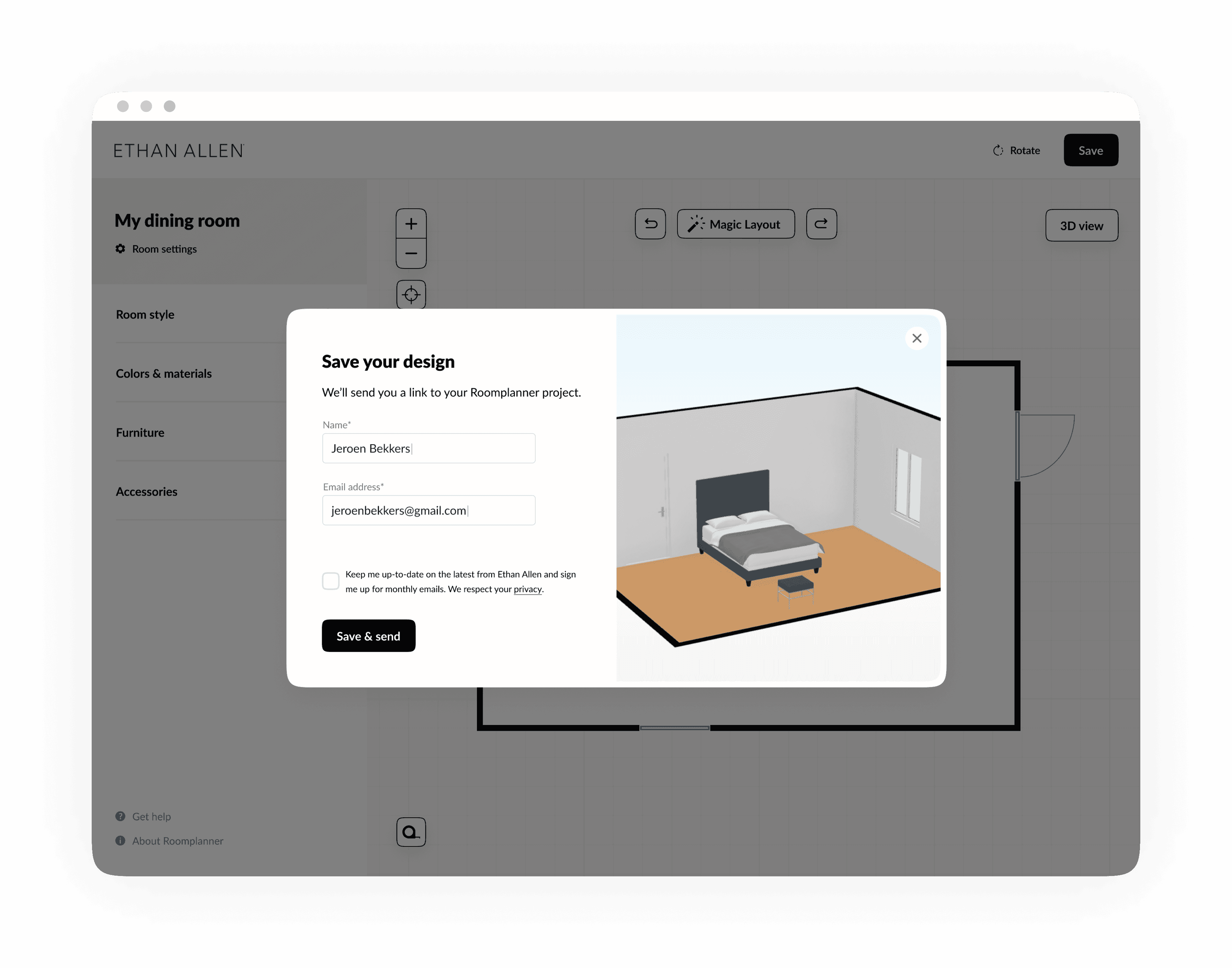
New design of the second modal in which help of an Ethan Allen designer is offered.
