My role: UX Design
Year: 2021
Project completed at Valsplat with my colleagues Caressa Fooij and Nils van den Broek
The streaming service of the Dutch public broadcaster offering live and on-demand tv. Their goal is to connect and enrich the Dutch public with programmes that inform, inspire and entertain.
Background
NPO started back in 2003 as a website (uitzendinggemist.nl) on which tv programmes could be replayed. their current platform still uses archaic UX patterns and they offer no personalisation for repeat users. No personalisation however also helps them stand out against other competitors as it brings a sense of nostalgia about consuming media like we did back in the olden times (watch television) and helped users discover and explore new content leading to more enriched experiences. Personalisation in streaming services has become standard today due to OTT platforms like Netflix, Disney+ and Amazon Prime and NPO wants to match these expectations for their users.
Problem Statement
How might we serve 18 million different people with a personalised experience (inside their bubble) but also help users explore and discover new content (outside their bubble) in one app?
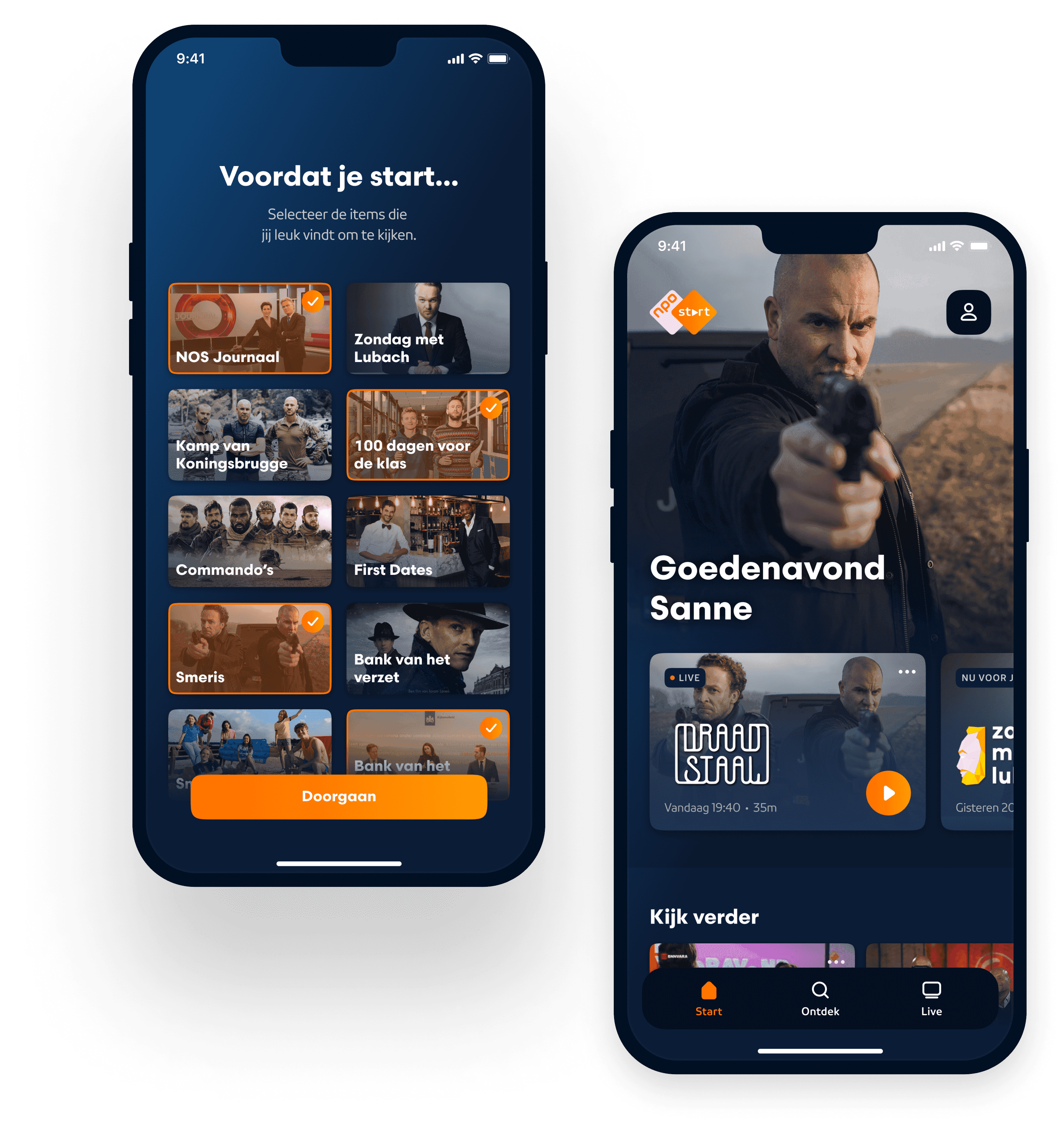
Relevant content from the start
In order to start with a personalized homescreen on the first landing, the user is asked to select favorite tv programmes before landing on the homepage.
First use flow
Prioritization of the platform structure
One of the design principles we created for the project states:
NPO Start is all about the content. We are proud of that, so we are happy to give it the stage it deserves. We'd rather have you watching than search endlessly.
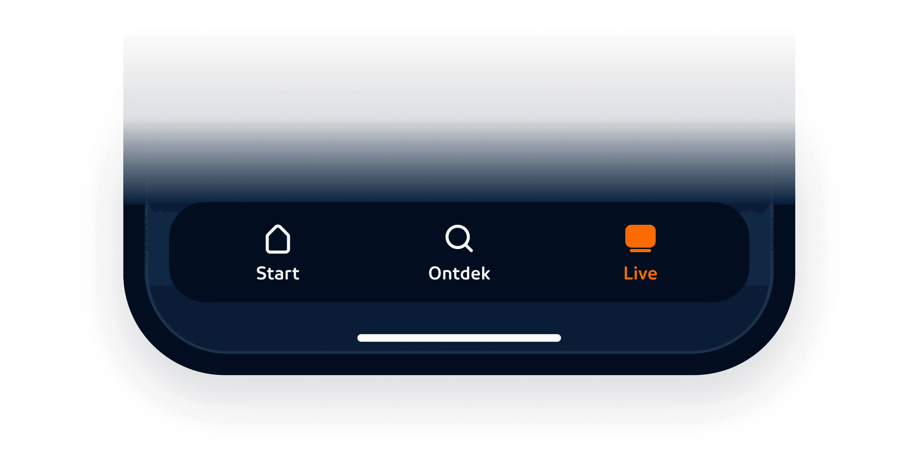
That's why the menu items are prioritized from most likely to watch something to less likely to watch something:
∙ Home: Content of and for you (inside the bubble)
∙ Explore: All content outside your current bubble.
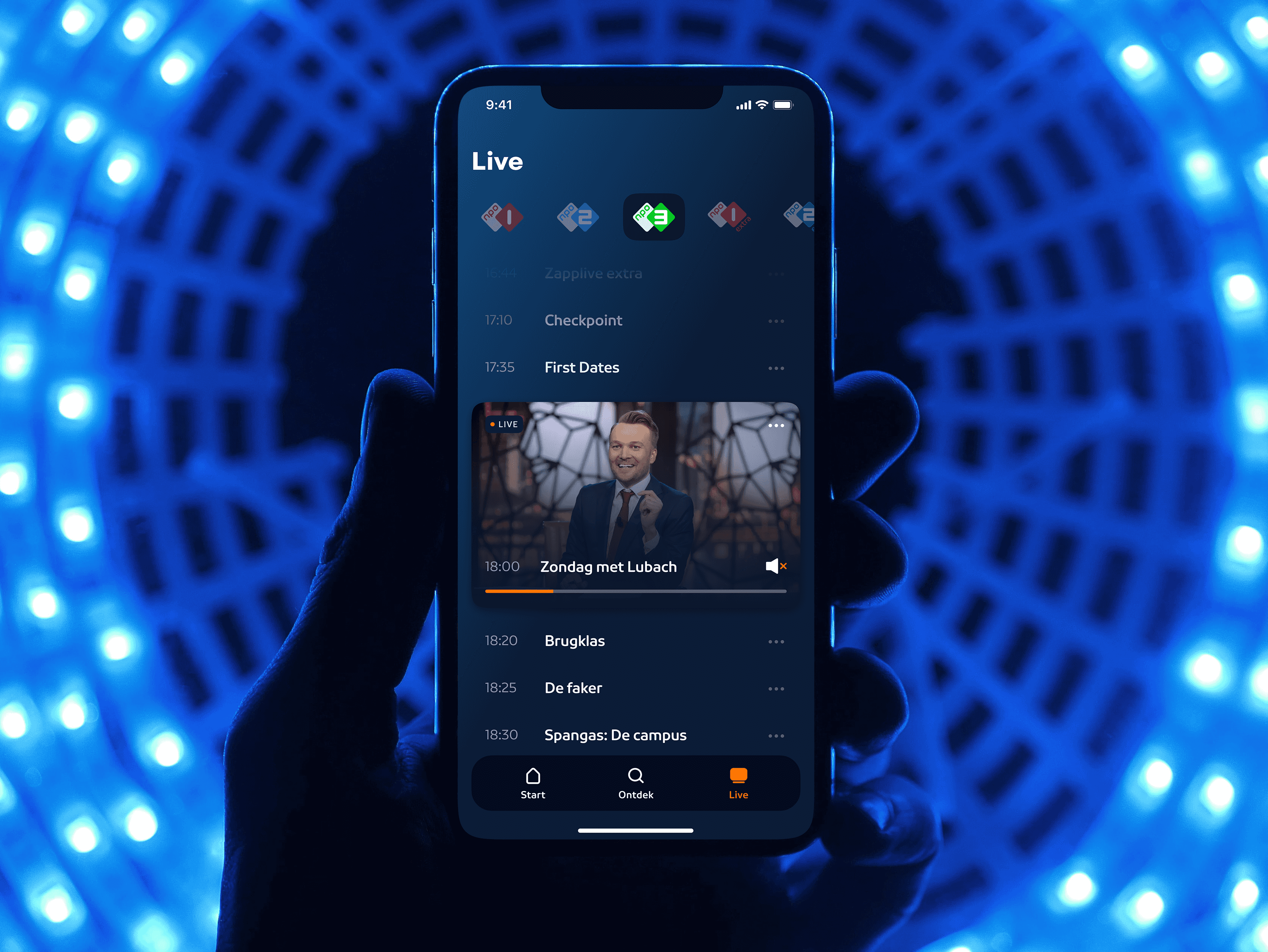
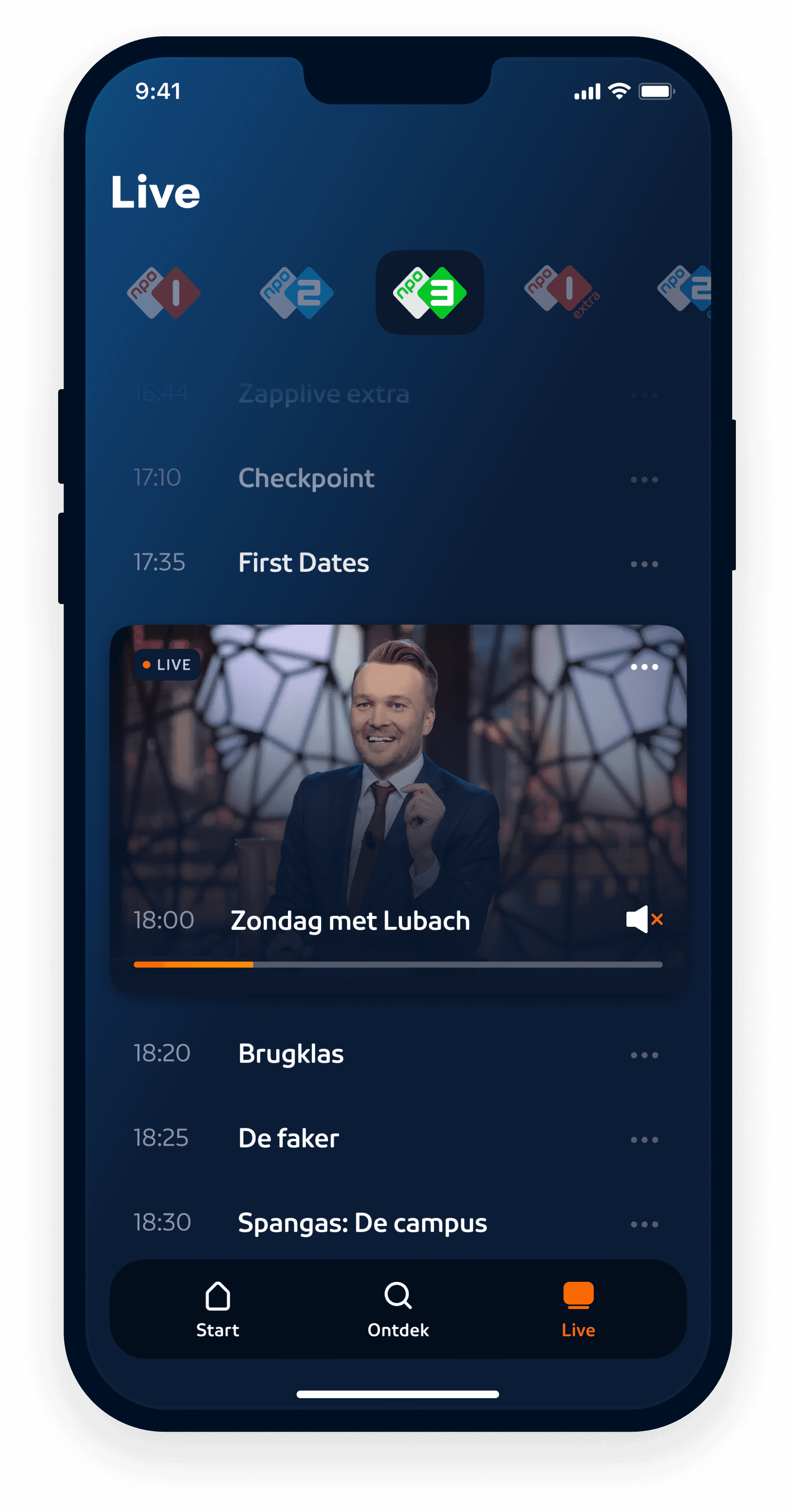
∙ Live: A tv guide which instantly throws you back in the last channel you've been watching.
Menu items
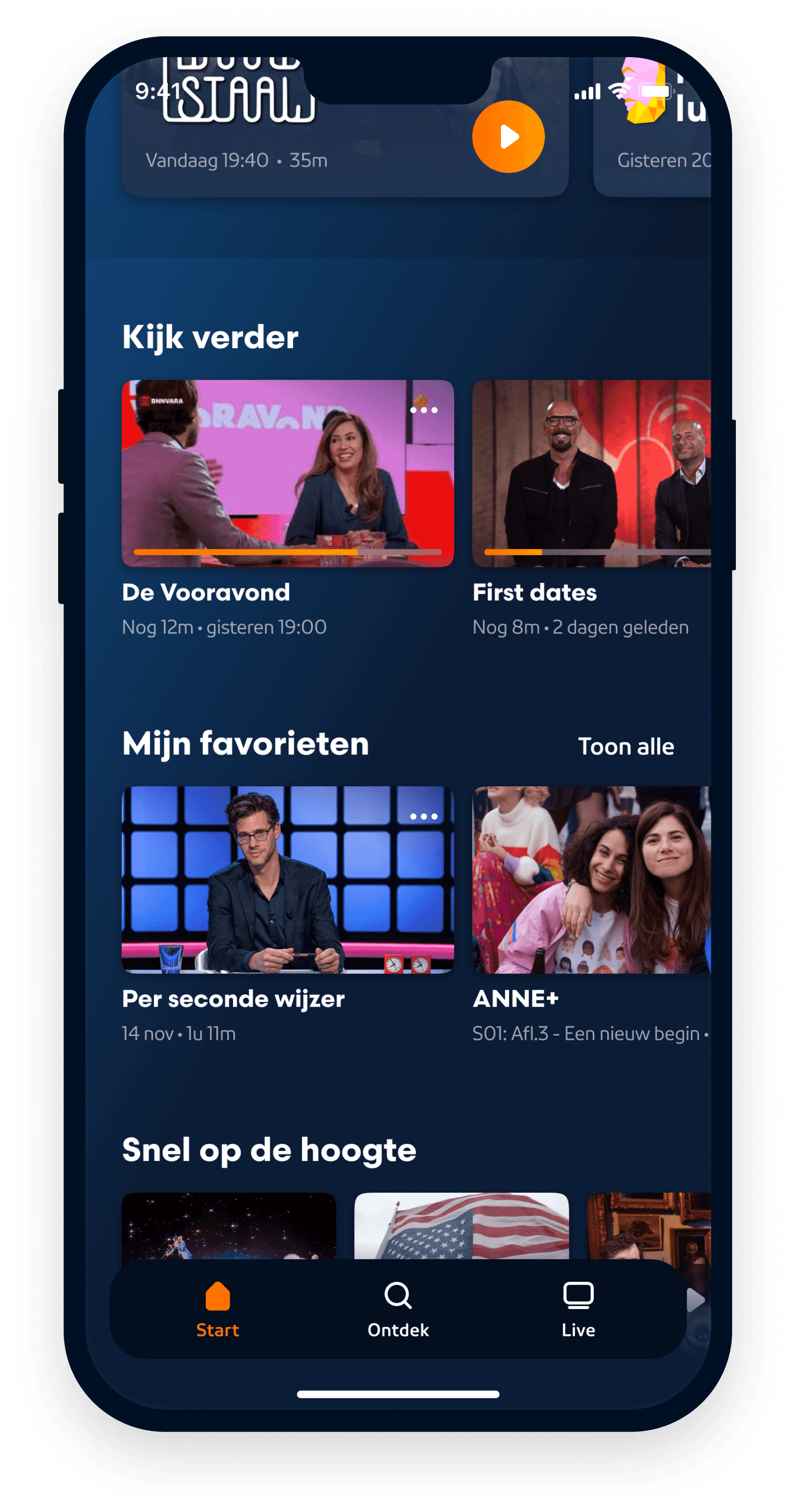
The content rows on the homepage are also prioritized from 'most personalized content' to 'less personalized content'. Content rows as 'Continue watching' and 'My favorites' are for example positioned at the top of the page. This enlarges the user's chance to tune in on something as quick as possible.
Most personalized content rows are positioned at the top of the 'Start' screen.
Transparant about data
Another design principle we created is:
100% trustworthy: NPO Start is 100% reliable. We handle your time, attention and data with care. We think that's completely normal. And that's why you feel completely at ease with us.
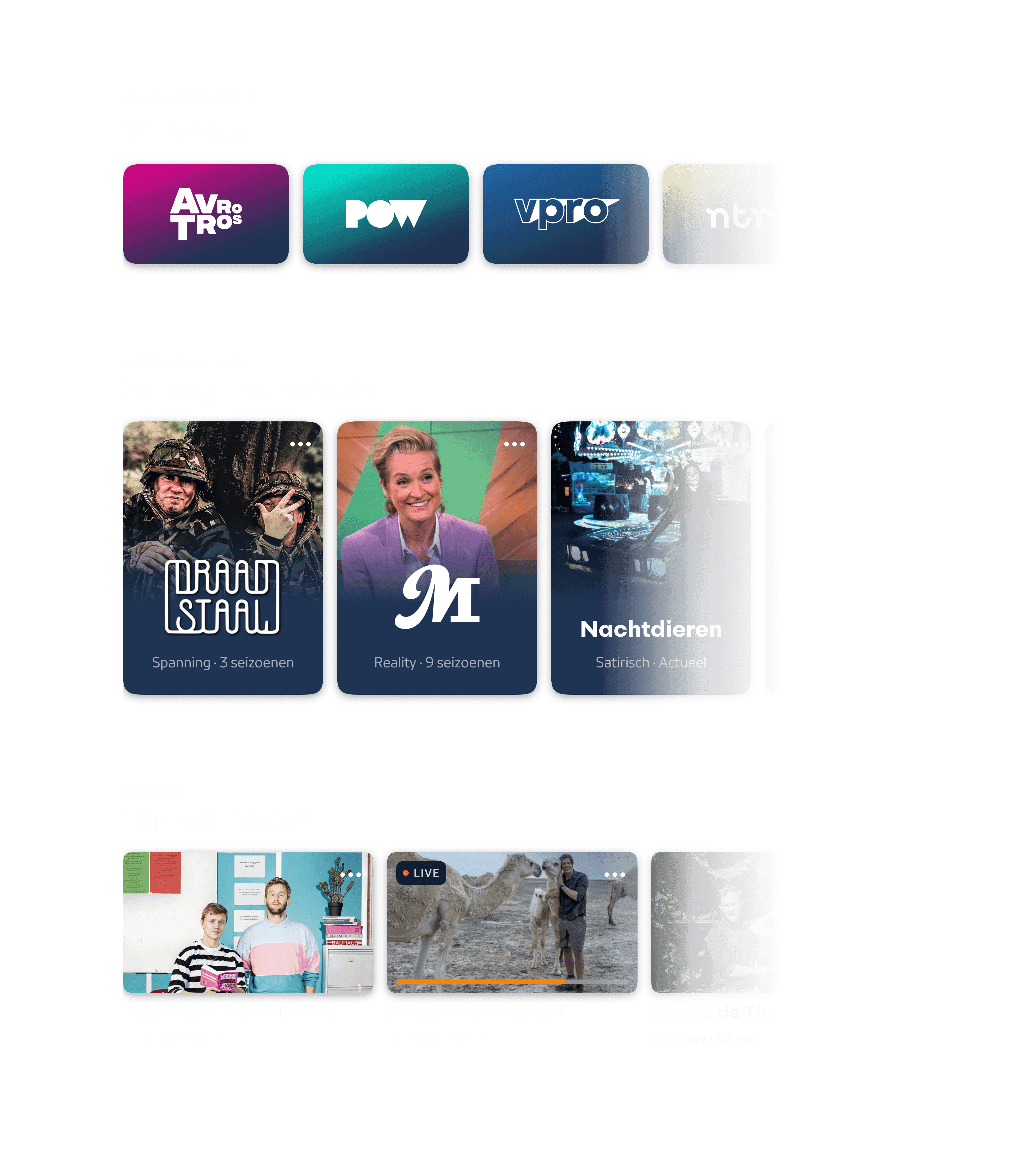
That's why for example titles of content rows tell the user where certain recommendations are based on.
Explore content outside the bubble
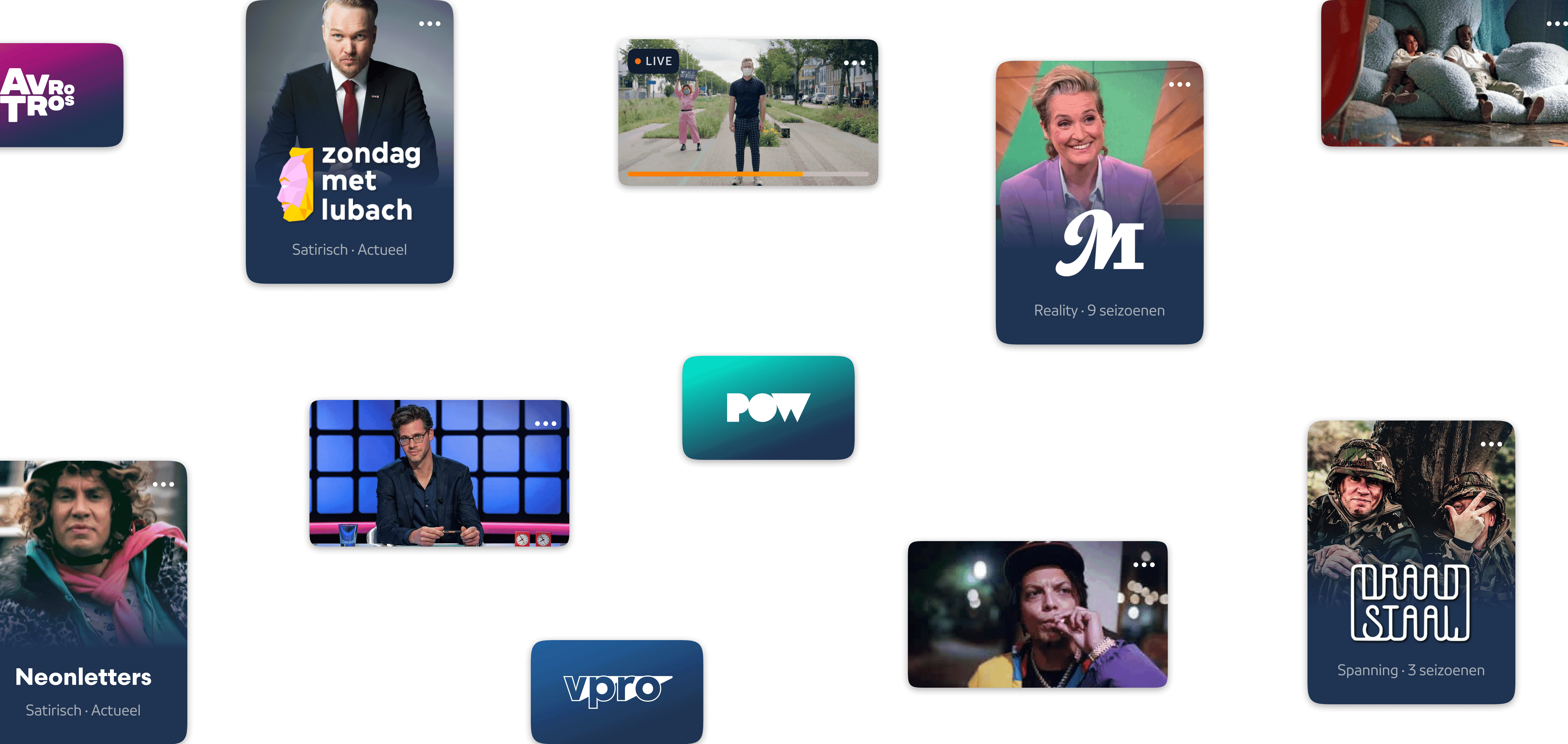
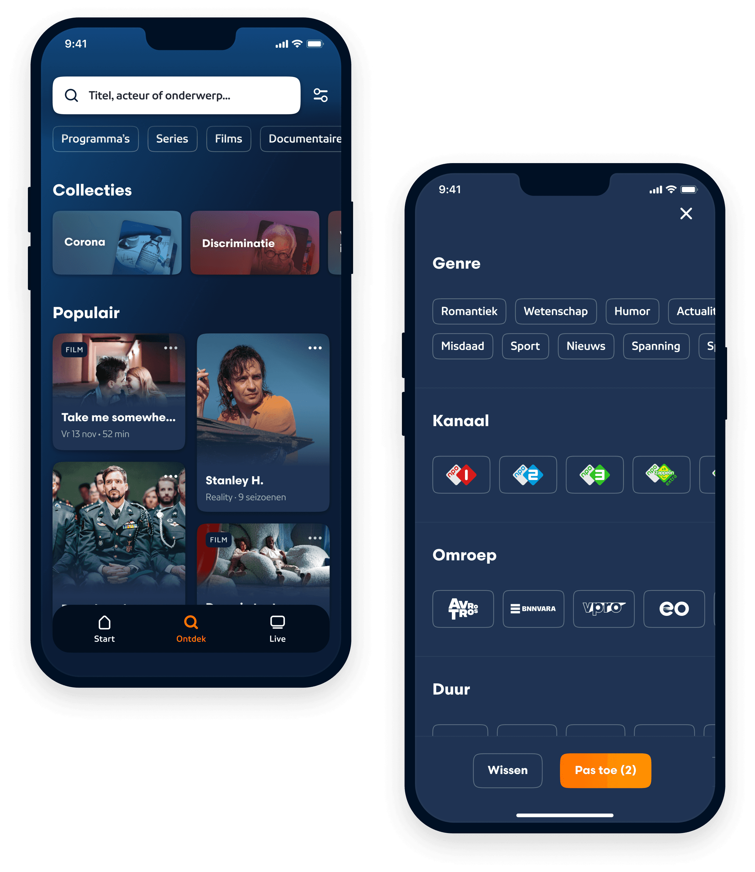
The 'Explore tab' contains content outside the users' bubble. It shows content that isn't personalized. An extensive set of filters helps to search implicitly for something to watch within the huge amount of content.
The menu tab 'Explore'
Skip the process of searching what to watch.
Research showed that one of the big differences between watching content via streaming services vs. television is that the process of finding something to watch takes longer via streaming services. A user first needs to search on the streaming service for something to watch before he starts watching. When watching something on tv it's just a matter of turning on the tv and start watching. In order to shorten the searching process, we copied copy this tv pattern to the NPO platform. When selecting the 'Live' menu tab the last watched channel opens up and the live program starts to play (without sound).
Menu tab 'Live'
Exploring content without leaving the page
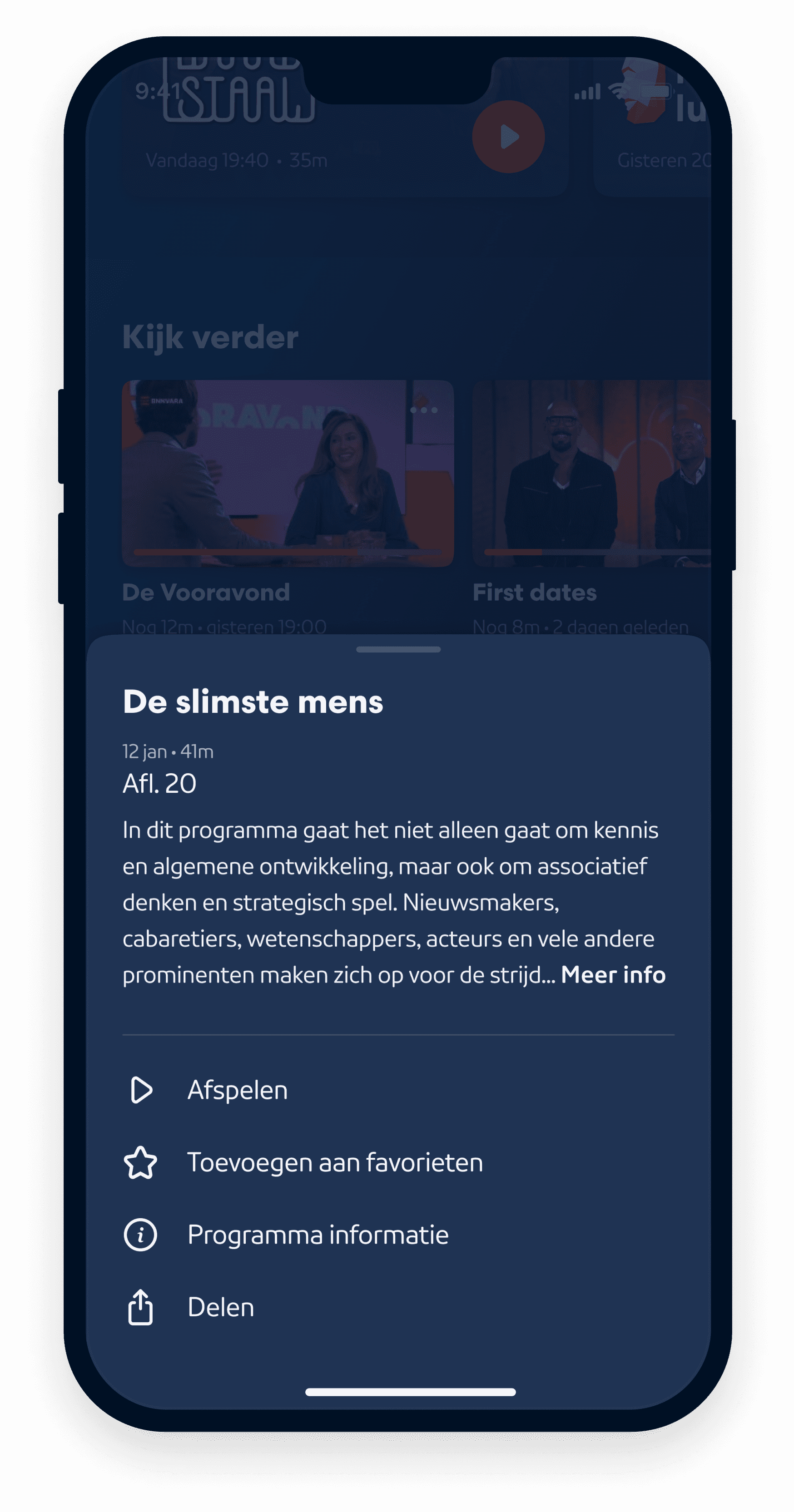
Images don't tell directly where the show is about. Users need more context in order to decide if they want to watch a certain program. That's why we created a bottomsheet which shows a summary where the programme is about. The advantage of showing this information in a bottomsheet is that the user can explore content quickly, instead of going back and forth between pages.
Bottom sheet example
