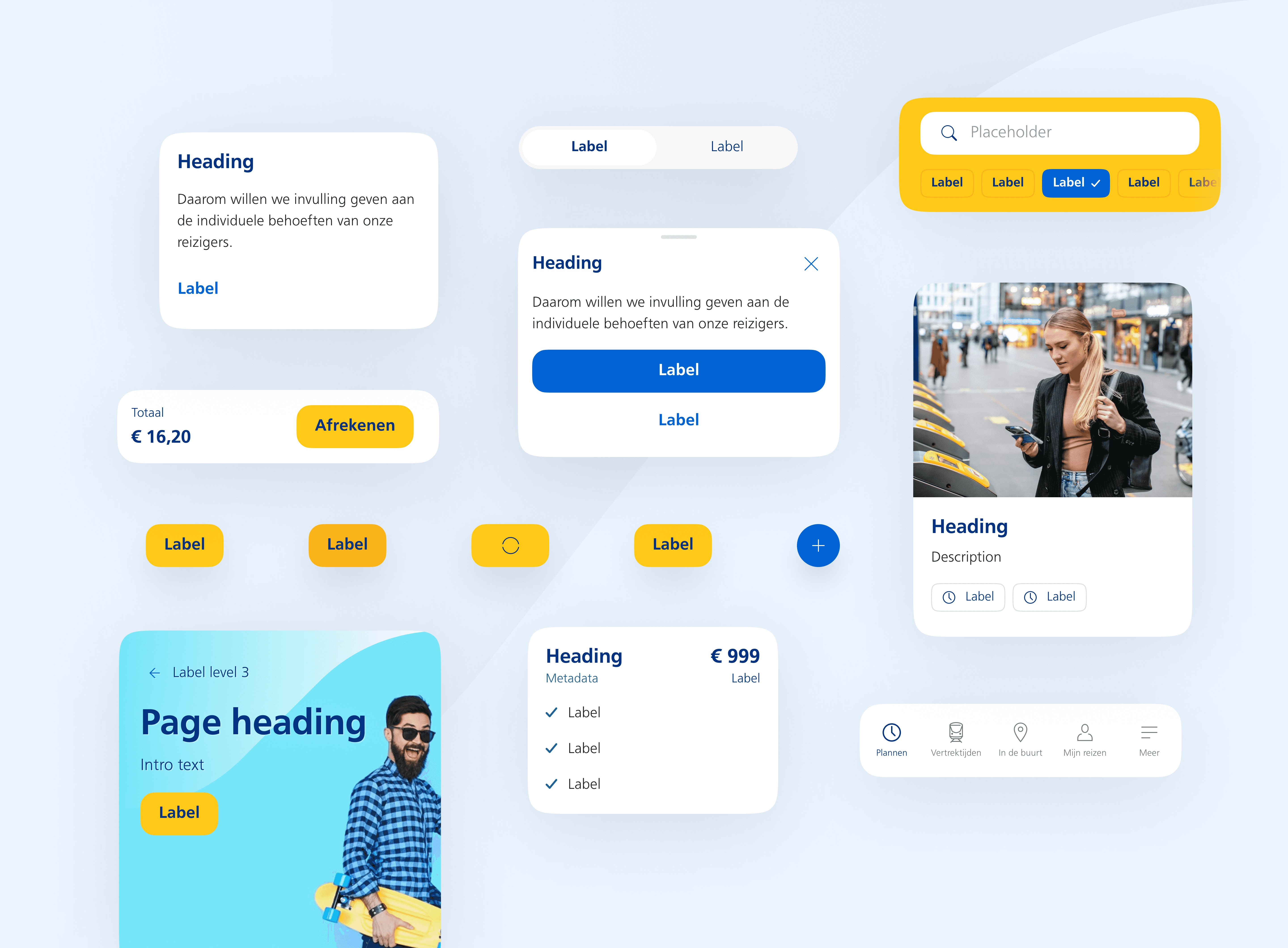
My role: UX/UI Design
Year: 2021
Project completed at Valsplat with my colleagues Jeffrey Lauwers, Niek van Bijnen (UX Designers), and Julian Neef (Design evangelist).
Nederlandse Spoorwegen (NS) is the leading railway company in The Netherlands.
A fragmented and inconsistent landscape
NS has many different digital channels (NS app, NS.nl, NS International). Channels that were created independently of each other. Over time, this caused a fragmented and inconsistent digital landscape.
The goal of this project was to create a design system. A single design language available for all designers and developers working on NS products.
Figma & Zeroheight
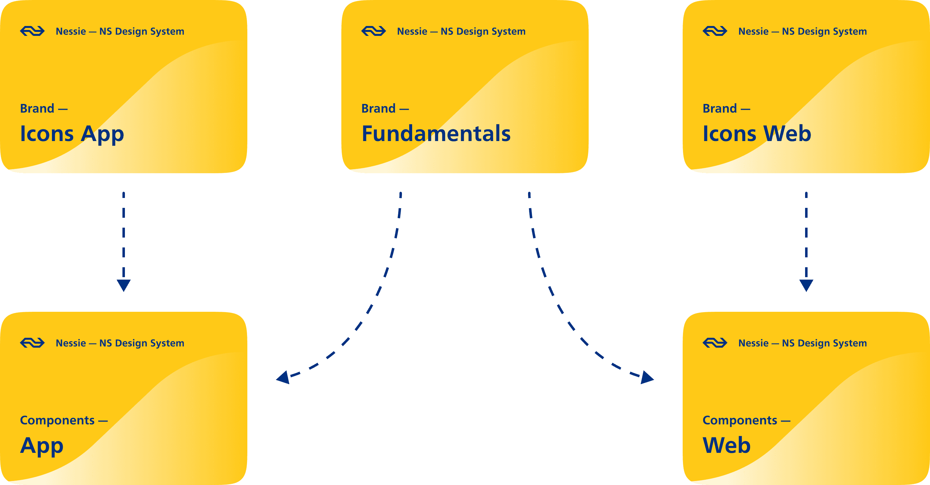
We used Figma to discover components, and create the style- and component libraries for web and app.
Zeroheight was used as a documentation platform. This is where per component its purpose, best practices, and accessibility and copy guidelines were documented.
Figma library setup
Inventorize components
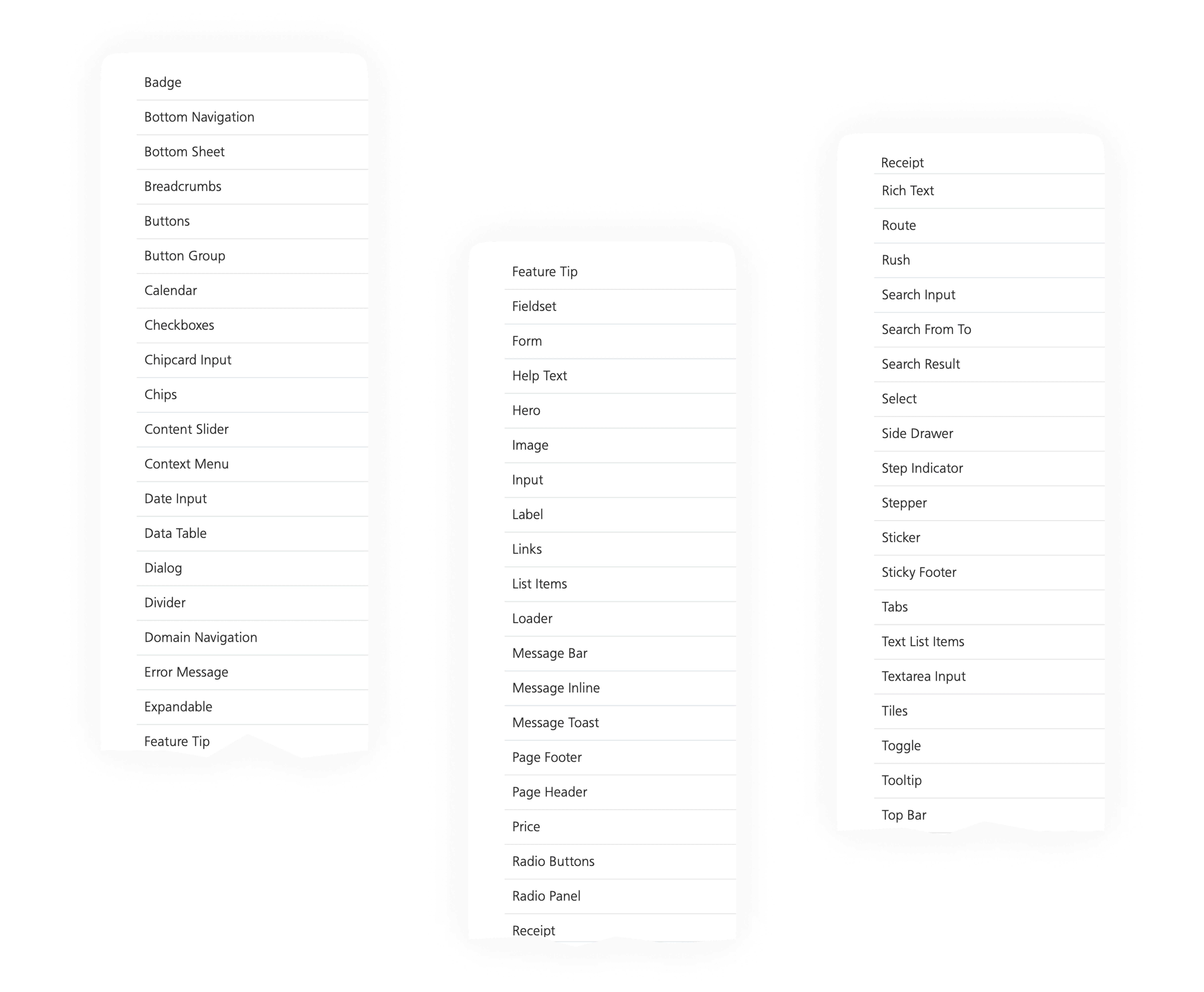
The project started with an inventarization of all the components and fundamentals that lived within the digital channels of NS.
Component creation process
Each component went through a discovery and a design phase.
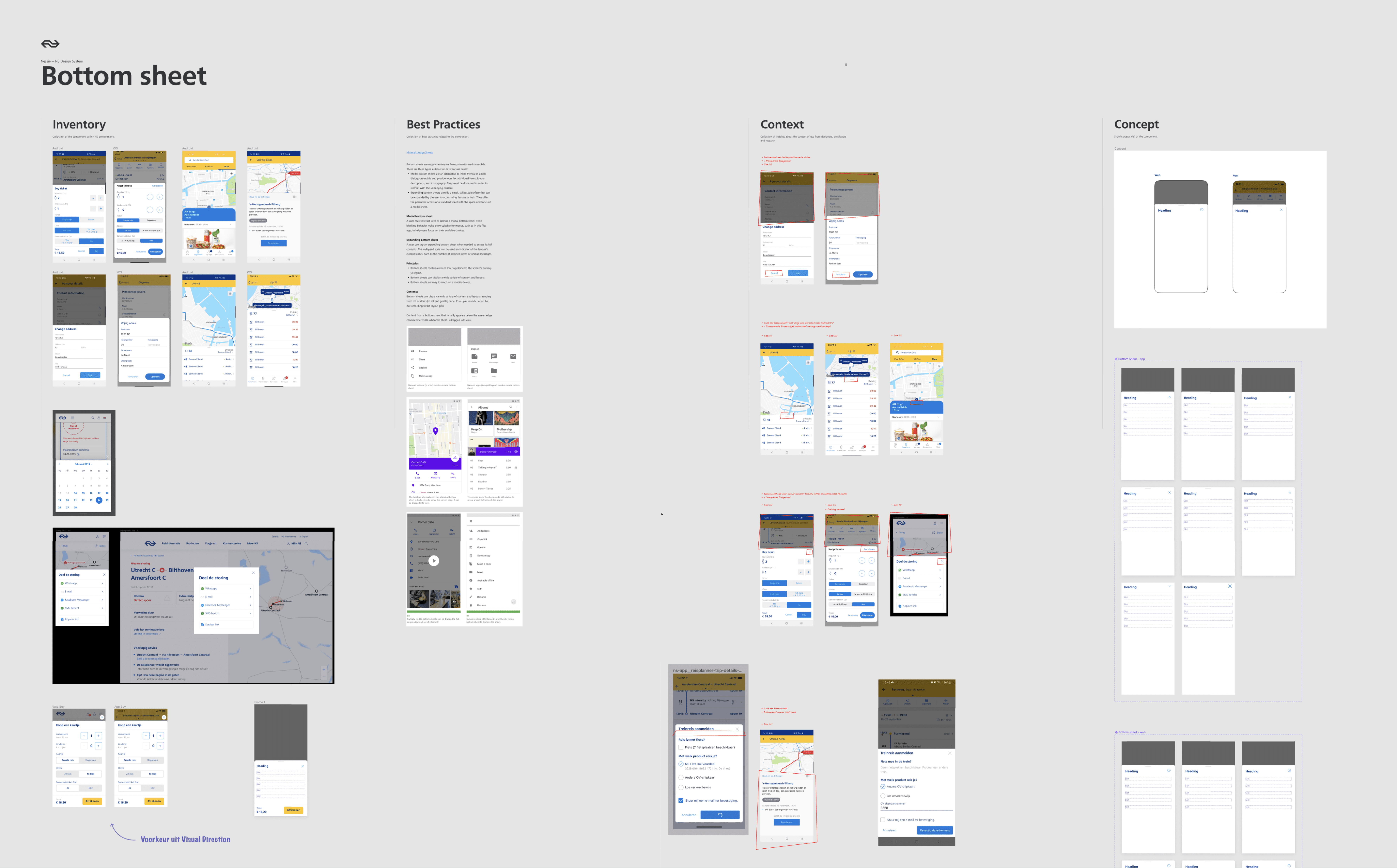
The discovery phase consists of 4 steps: Inventory, Best practices, Context, Concept.

Step 1: Inventory
During the inventory step, we looked at the work that had already been done for this component. What does the current component look like in Figma. And which variations of the component do we encounter within the NS environments. For this we looked at the NS Android & iOS apps and the NS website. We captured screenshots of the component and placed them under the 'inventory' step in Figma.
Step 2: Best practices
The aim of this step was to collect component related best practices. For this we used a variety of sources such as nngroup.com, material design, iOS guidelines and component.gallery. This last source is a collection of all kinds of different design systems from brands such as Uber, IBM and Salesforce.
Step 3: Context
In this step we collected insights about the context of the component usage from designers, developers and researchers. We looked at the insights we gathered and wrote down questions and things we noticed.
An example of something we noticed regarding the Bottom Sheet component was that there were a lot of different ways of closing a Bottom Sheet. In some cases the 'close' icon was positioned within the right top corner of the Bottom Sheet. While in other cases it was positioned right above the right top corner outside the Bottom Sheet.
Observations of closing a Bottom Sheet within the NS environments
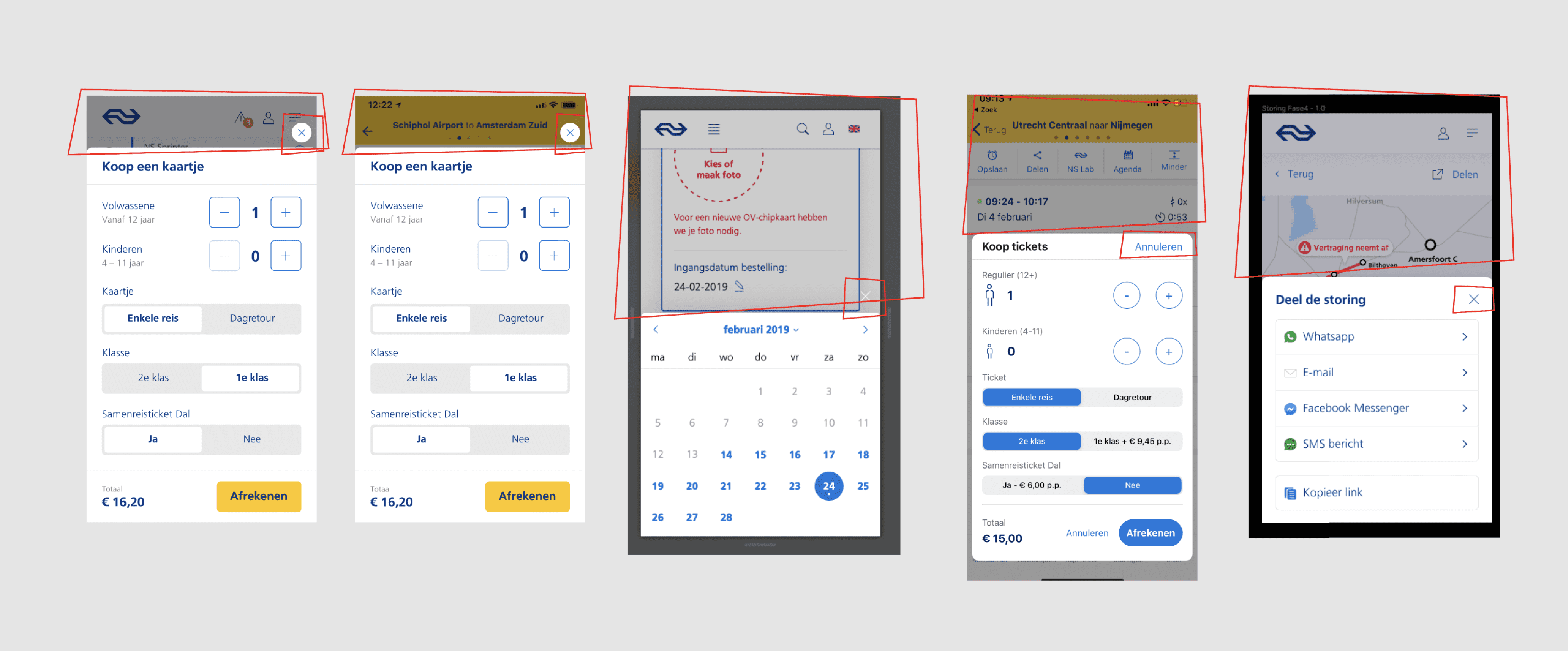
Another thing we kept in mind during this step was accessibility. What is the current contrast ratio? Is the tapping area of the component smaller than 48px? Is the font size large enough? Etc.
Checking these things eventually helped us to make each component compliance with the WCAG2.0 guidelines. And as a result that the NS environments can be used by everyone.
Step 4: Concept
Finally, we designed one or more concepts of the component. During a weekly component review session with designers and developers from NS, we answered the questions from step 3. We made decisions and made sure that the component could be developed for iOS, Android, and web.
Discovery phase example of the 'Bottom Sheet' component
Creating and documenting
The design phase consists of 2 steps. Creating the final design of the component and publishing it in the Figma NS library. And documenting the guidelines and best practices of the component in Zeroheight.
Creating the final design
Within a design system there are always components that are similar to each other, with only slight differences.
For example: A button needs to be available in various states and sizes, and with or without icon etc.
Figma offers the possibility to create variants. Variants are component combinations that can be grouped as a single component set. A set contains components with different properties and the values of an instance can be configured.
Example of different variants of the 'Step Indicator' component
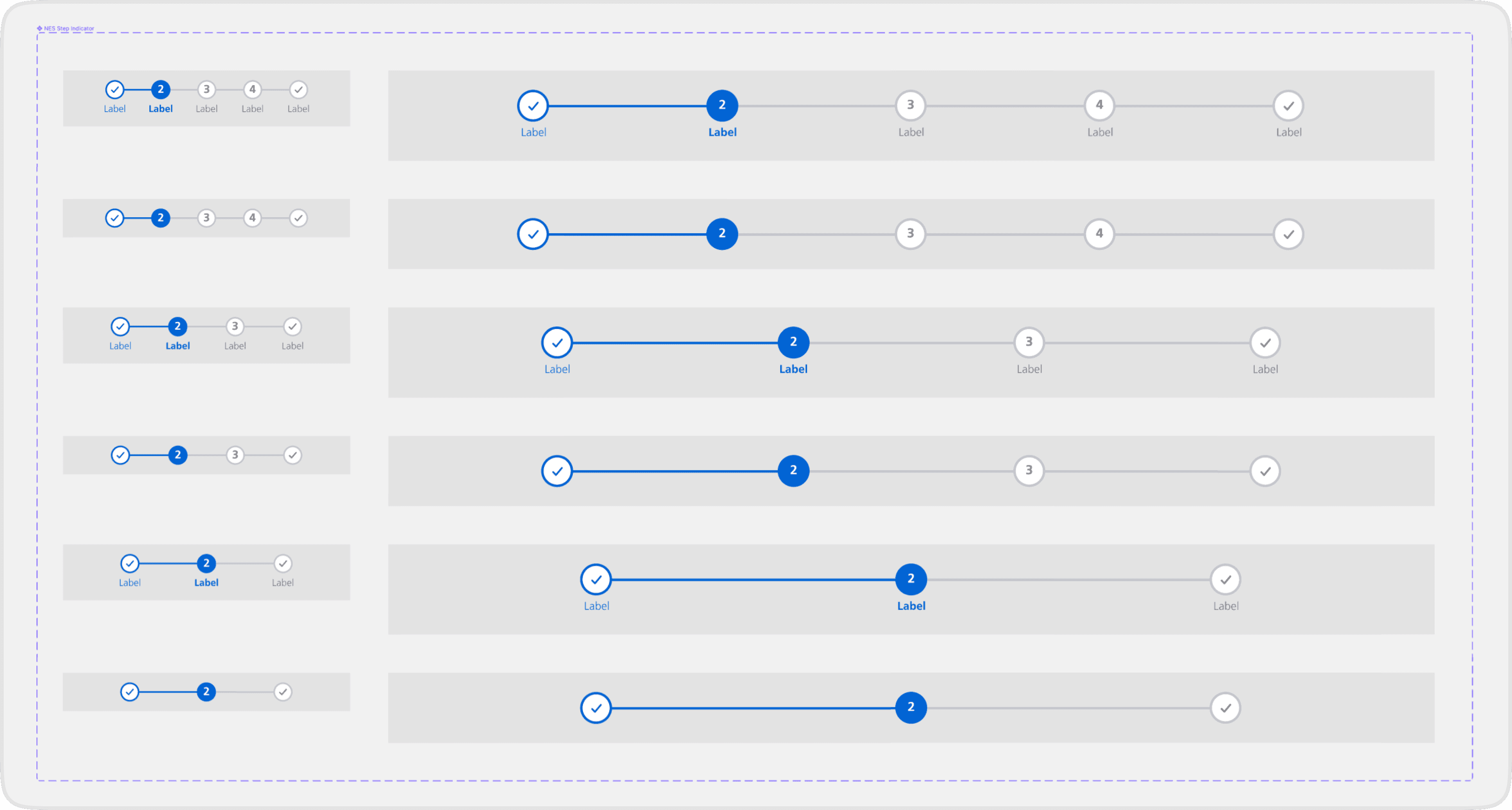
We designed each component in a way that when NS designers for example drag the 'Step Indicator' component on their canvas they have the possibility to adjust the component to their needs. They can switch the value of the property 'Label' to 'off'. The value of the 'Steps' property can be changed to another amount and the value of the 'Viewport' property can be changed to 'Large'.
Properties and values of the Step Indicator component

Properties and values of the Sticker component

Properties and values of the Message Inline component

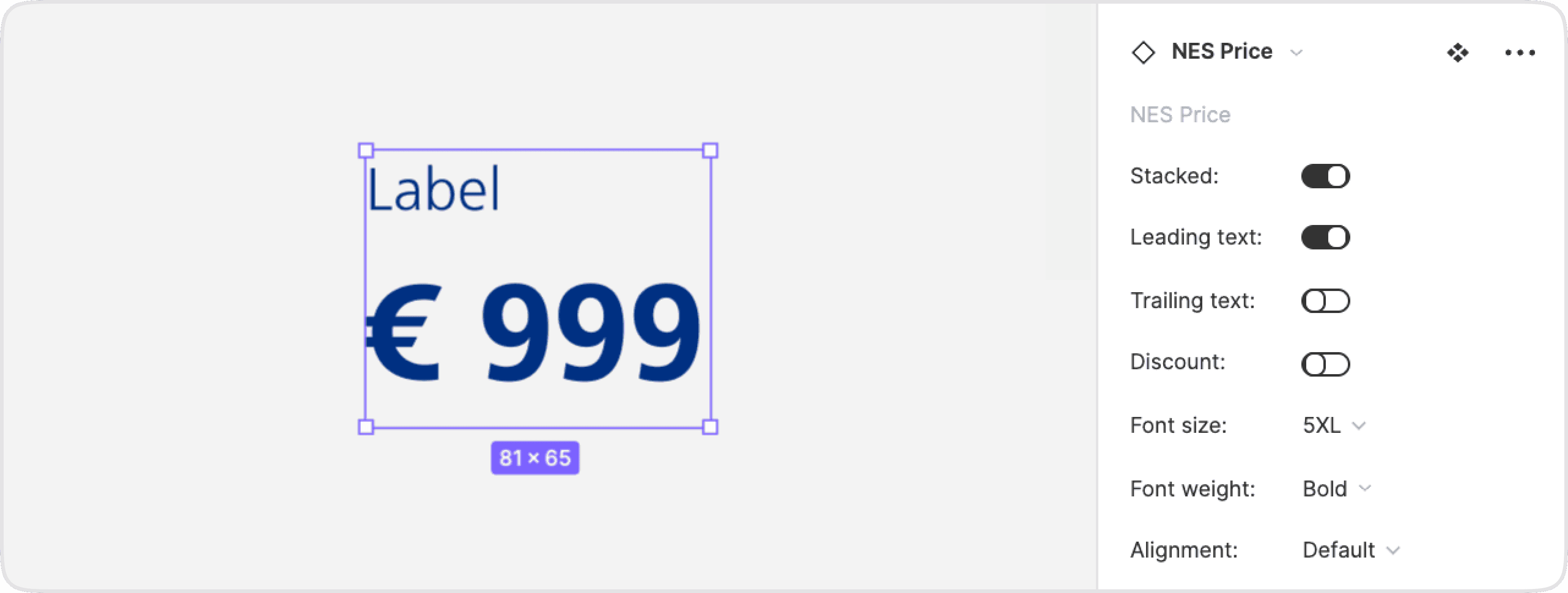
Properties and values of the Price component
Documenting in Zeroheight
We used Zeroheight as a documentation platform. This is where everything about the design system is documented: A starting guide for designers and developers, Design principles, and Accessibility guidelines.
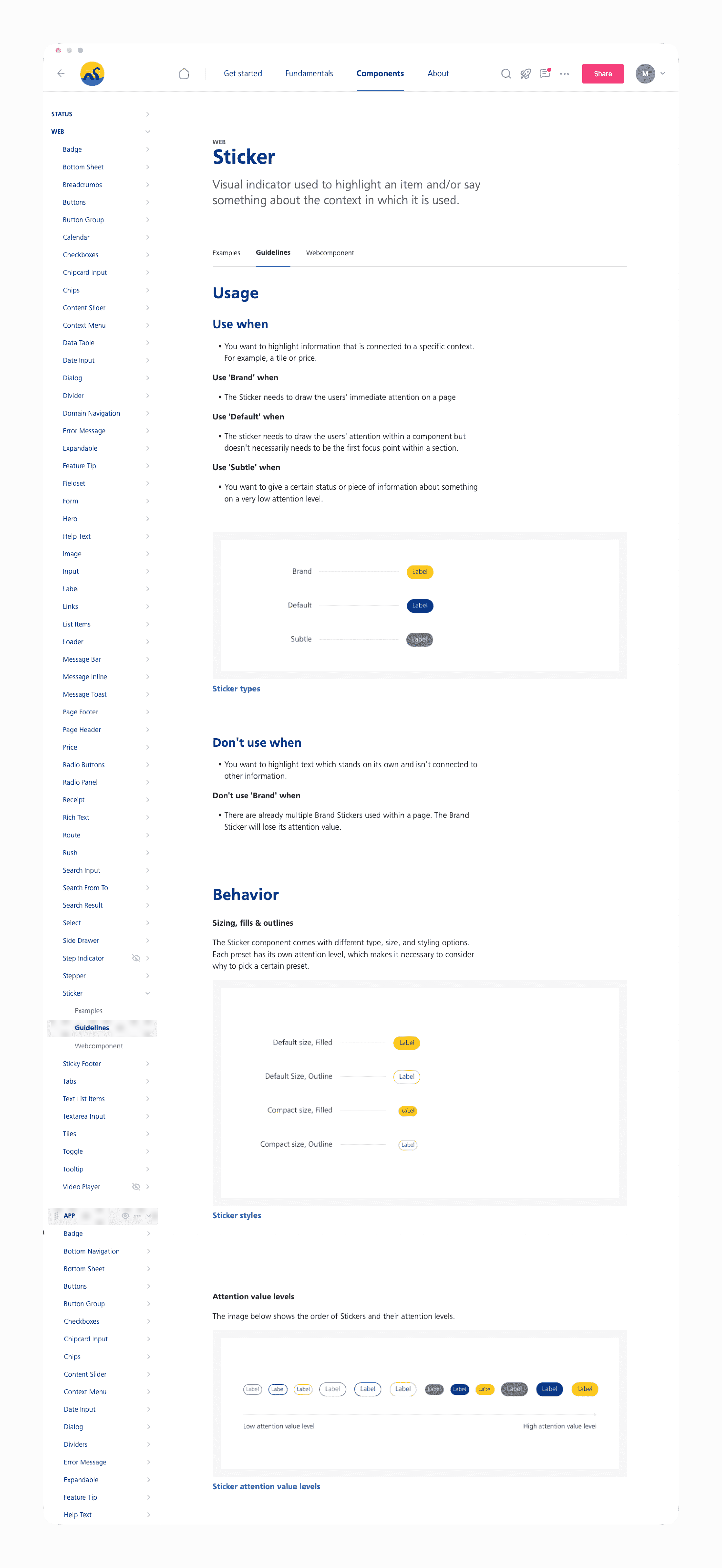
Next to that, each component has its own page in which its purpose, best practices, and accessibility and copy guidelines are documented. In this way, designers of NS get to know which component they can use for the use case they're working on.
The images within the Zeroheight component pages are connected with a Figma documentation file. In this way, when a component in the Figma library changes, the changes will be pushed to the Zeroheight environment too.
Screenshot of a Zeroheight component page
